Trading Pal — Mobile App

About
Through Trading Pal's platform, users exercised control, selecting preferred tools, order types, and profit objectives. They engaged in real-time trading across currencies, commodities, and indices, while also gaining insights into personal and others' portfolios, operational statistics, and return rates. Trading Pal represented a comprehensive and user-friendly approach to global investing within the fintech landscape.
Service
Ux/Ui Design, Ui Implementation, Ui Development.
Client
Trading Pal | Flare FX
Tools
Sketch, InVision, Adobe Xd, Adobe Photoshop, Adobe Illustrator.
Team
Ux Design Team, Developers and TP Traders.
🧩 Problem
In 2018, the mobile market experienced a significant shift with the mass adoption of all-screen devices such as the iPhone X and Samsung Galaxy S8.
Through Trustpilot and direct user feedback, we identified that:
The current Trading Pal interface:
• It didn’t take full advantage of the screen space.
• It had obsolete margins and bars
• It generated visual friction on devices with a notch and new proportions
• Users perceived the app as outdated compared to other emerging fintech products
• Visualization of financial data (charts, metrics, traders) felt cramped and unclear
This caused:
• Less confidence in the product
• Difficulty consuming critical trading information
• Risk of abandonment towards apps better optimized for new devices
🔍 Validate
To confirm that the problem was not just visual, we followed a structured UX Research process:
Validation sources:
Trustpilot reviews → recurring complaints about viewing experience
Customer support tickets → navigation confusion
Device analytics → notable growth on iPhone X / Galaxy S8
Competitive analysis → fintechs already adopting edge-to-edge UI
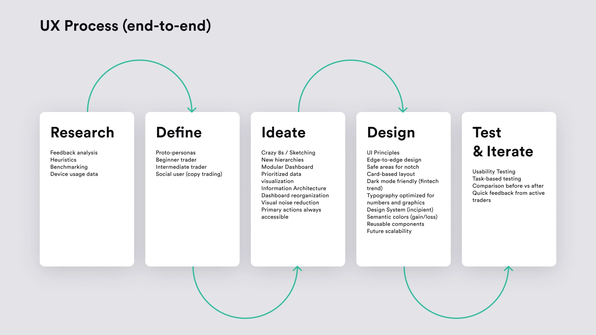
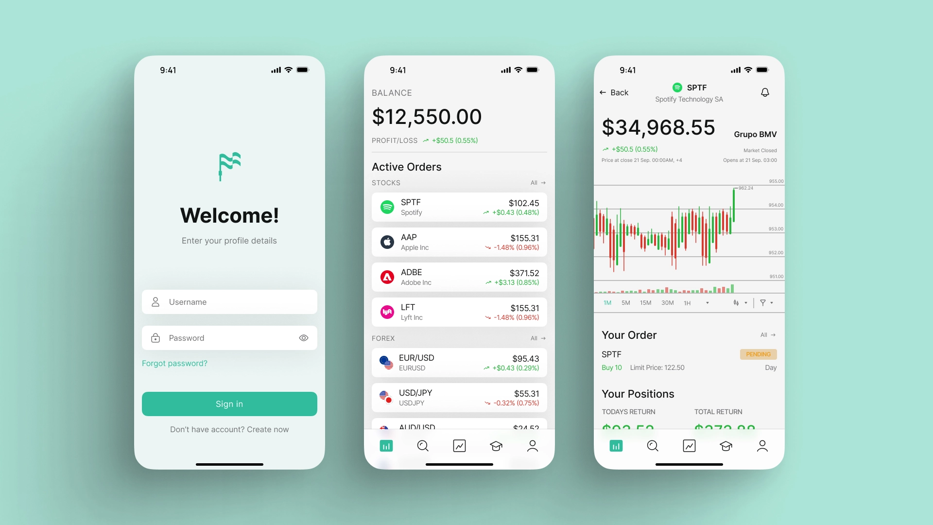
💡 Solution
We redesigned Trading Pal with a mobile-first and full screen approach, achieving:
• Interface optimized for all-screen devices
• Efficient use of visual space
• Clear hierarchy of critical information
• Simplified navigation
• Modern design aligned with leading fintechs
Key changes:
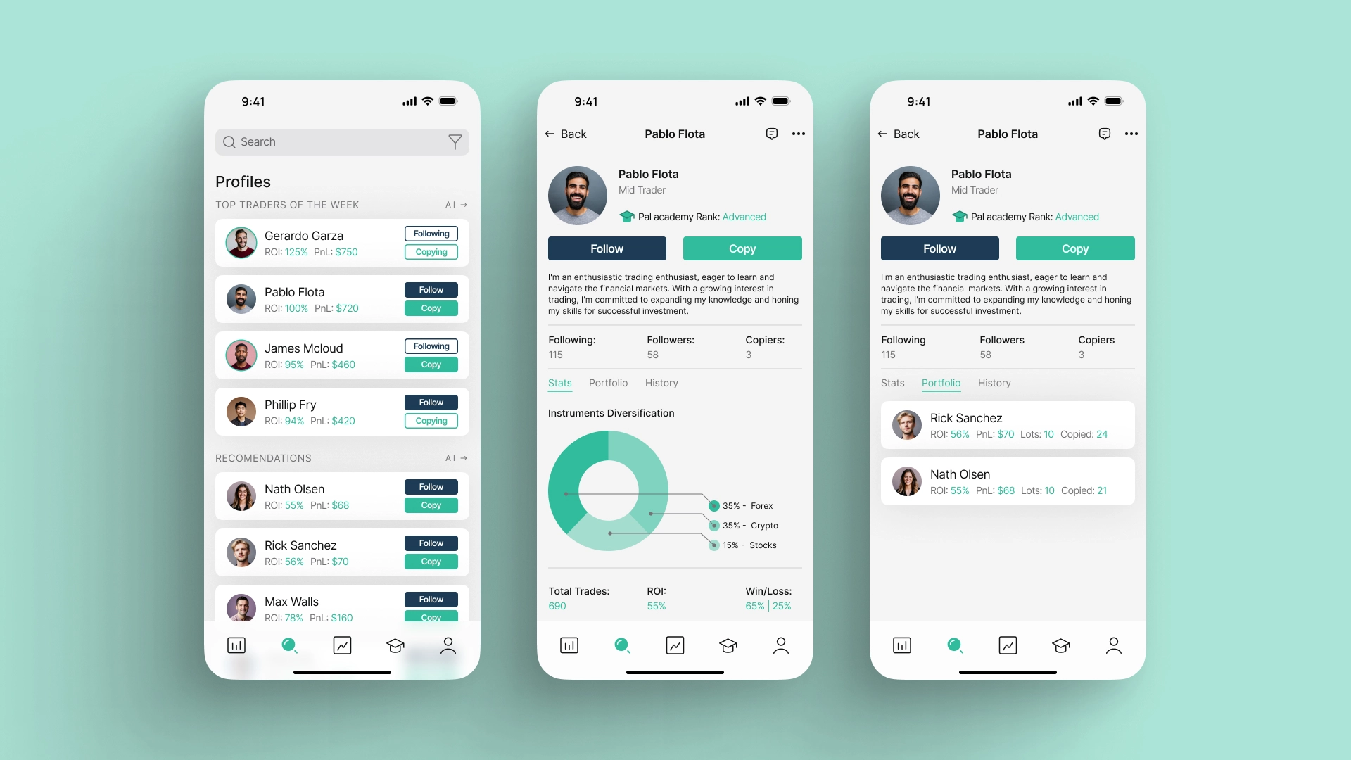
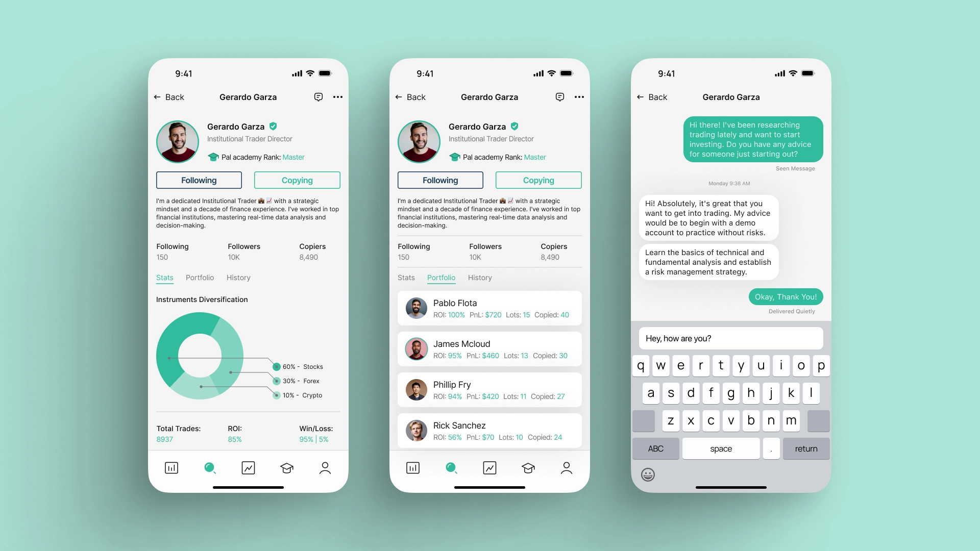
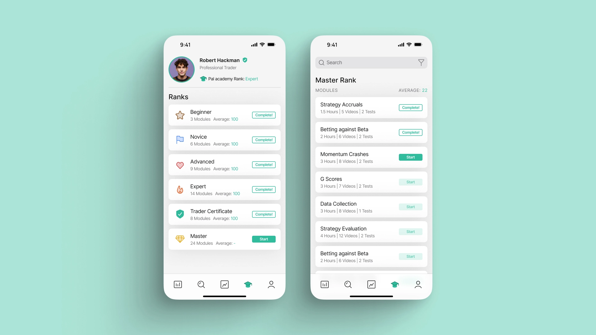
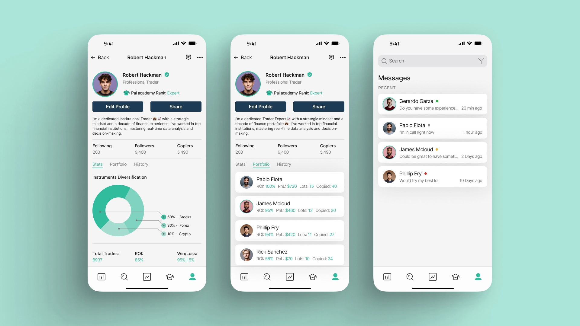
• Redesigned Dashboard
• More readable graphics
• Trader profiles with better metrics visualization
• More immersive and professional experience
📈 Result
Qualitative results:
• More reliable and modern product perception
• Greater clarity in metrics and decisions
• Positive feedback about the new viewing experience
Quantitative results (expected/measured):
• Increse the engagement in dashboard.
• Decrease the friction in navigation.
• Decrease the negative feedback about UI.
• Increse the retention in mobile users.
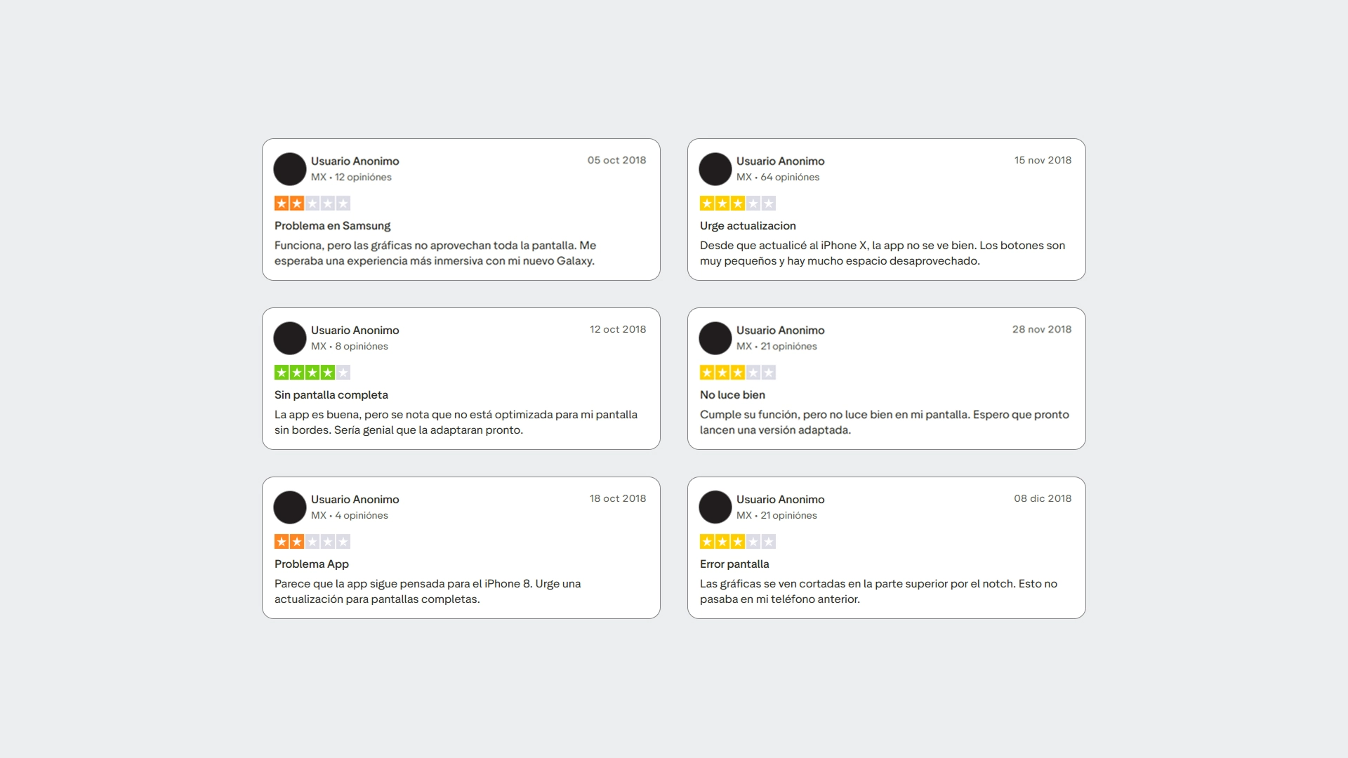
💬 Trustpilot — User Feedback Analysis
I analyzed real user reviews on Trustpilot to identify patterns of frustration and negative perceptions of the app before the redesign.
The comments revealed recurring problems related to an outdated interface, poor use of screen space on full-screen devices, and difficulty accessing critical financial information.
This analysis confirmed that the problem was not isolated, but rather a clear trend associated with the hardware change (iPhone X and Galaxy S8), serving as a starting point to justify a complete UX/UI redesign.
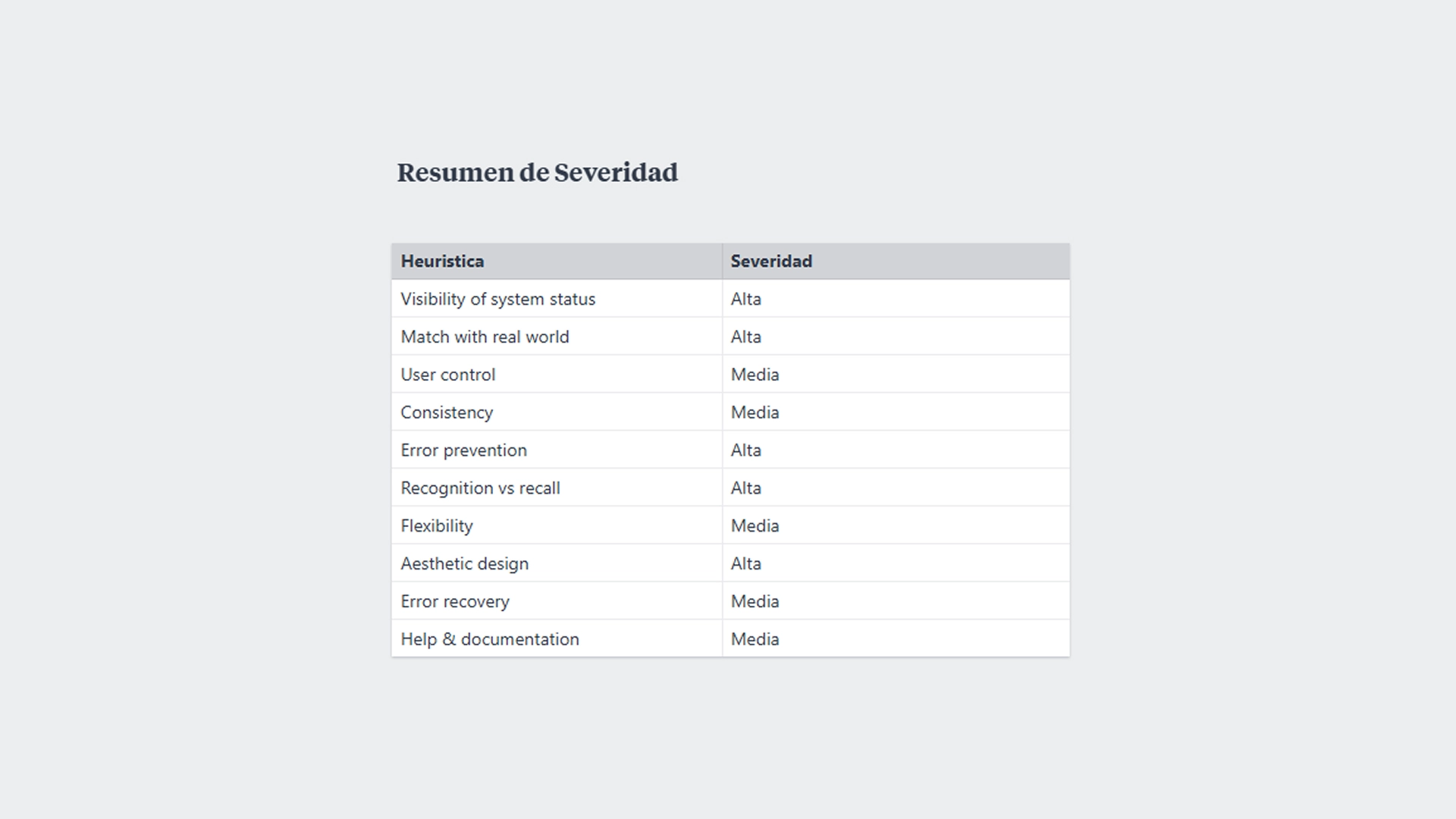
📋 Heuristic Evaluation — Severity Summary (Nielsen)
I conducted a heuristic assessment based on Nielsen’s 10 heuristics to identify usability issues beyond the visual aspect.
Each finding was categorized by severity level, allowing me to prioritize critical problems related to information hierarchy, system feedback, error prevention, and space utilization.
This process helped transform qualitative feedback into actionable issues, aligning design decisions with a direct impact on the user experience.
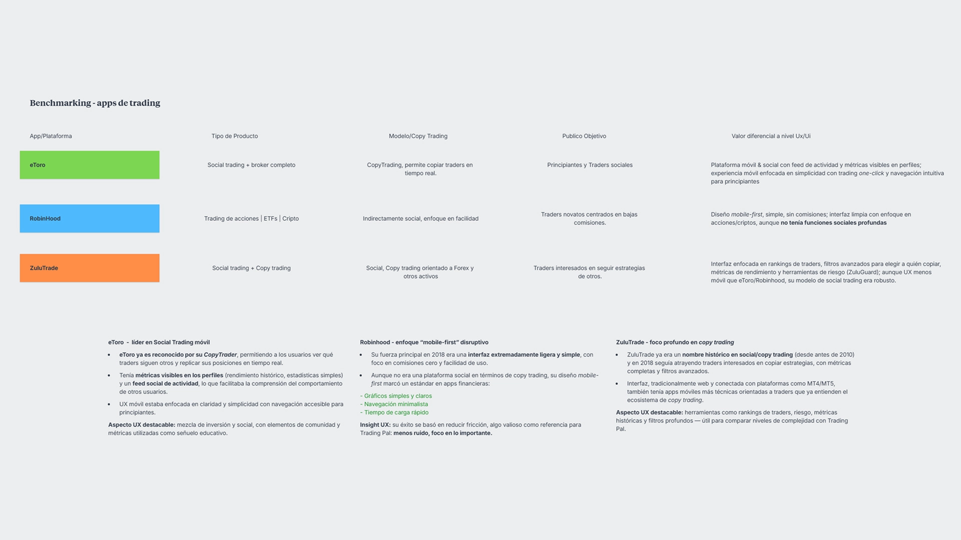
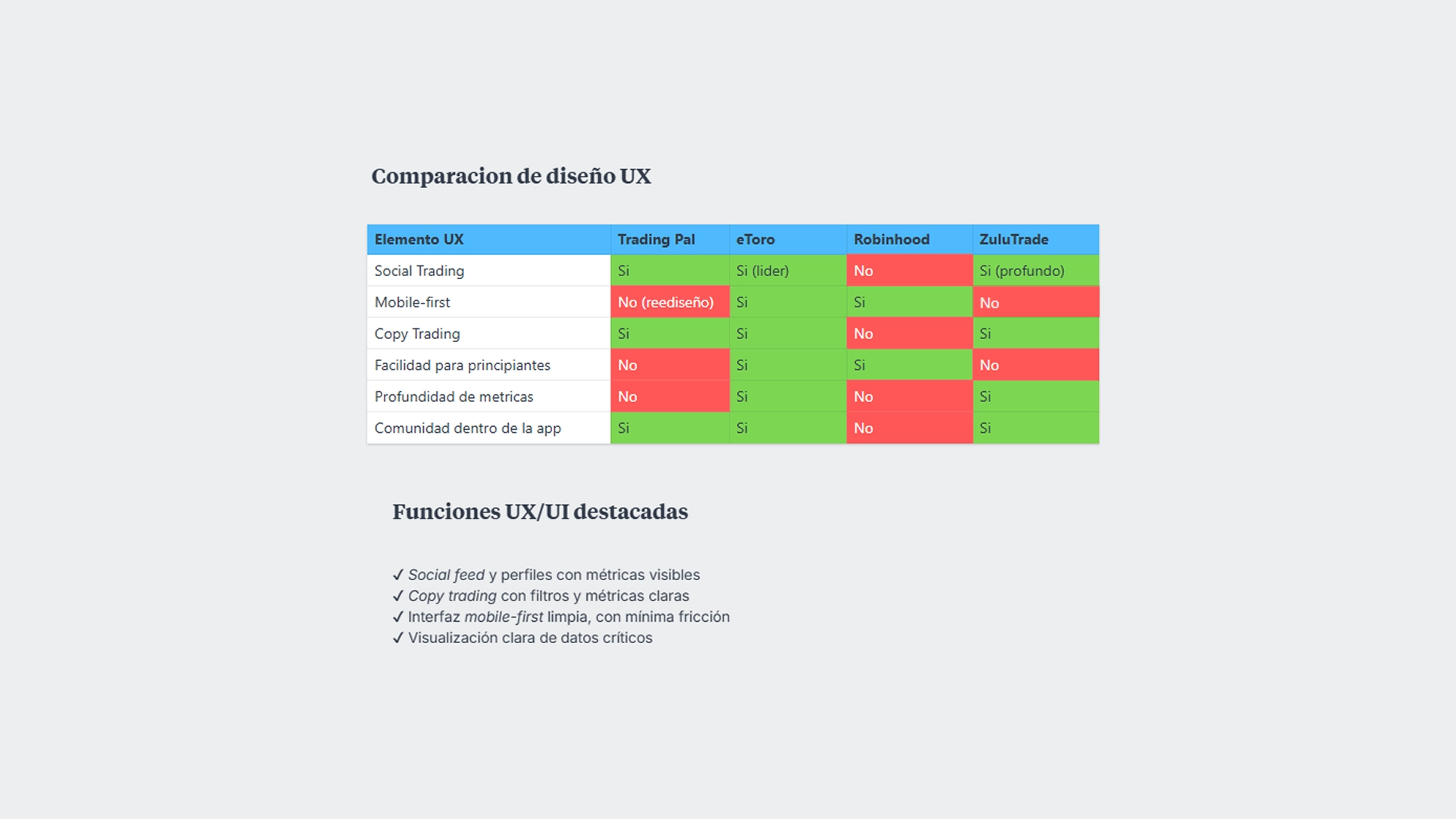
📊 Benchmarking
I analyzed leading trading platforms in 2018—eToro, Robinhood, and ZuluTrade—to understand market standards, interaction patterns, and UX/UI approaches in fintech and social trading products.
The benchmarking allowed me to identify:
• Best practices in mobile-first design
• Differences in complexity versus simplicity
• Opportunities to combine social trading with visual clarity
The insights gained served as a strategic reference for positioning Trading Pal within the competitive ecosystem.
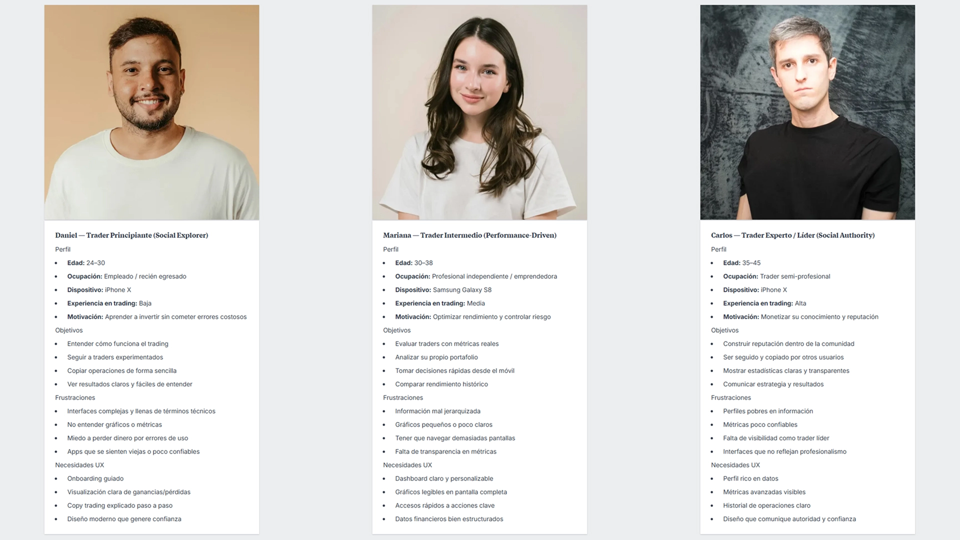
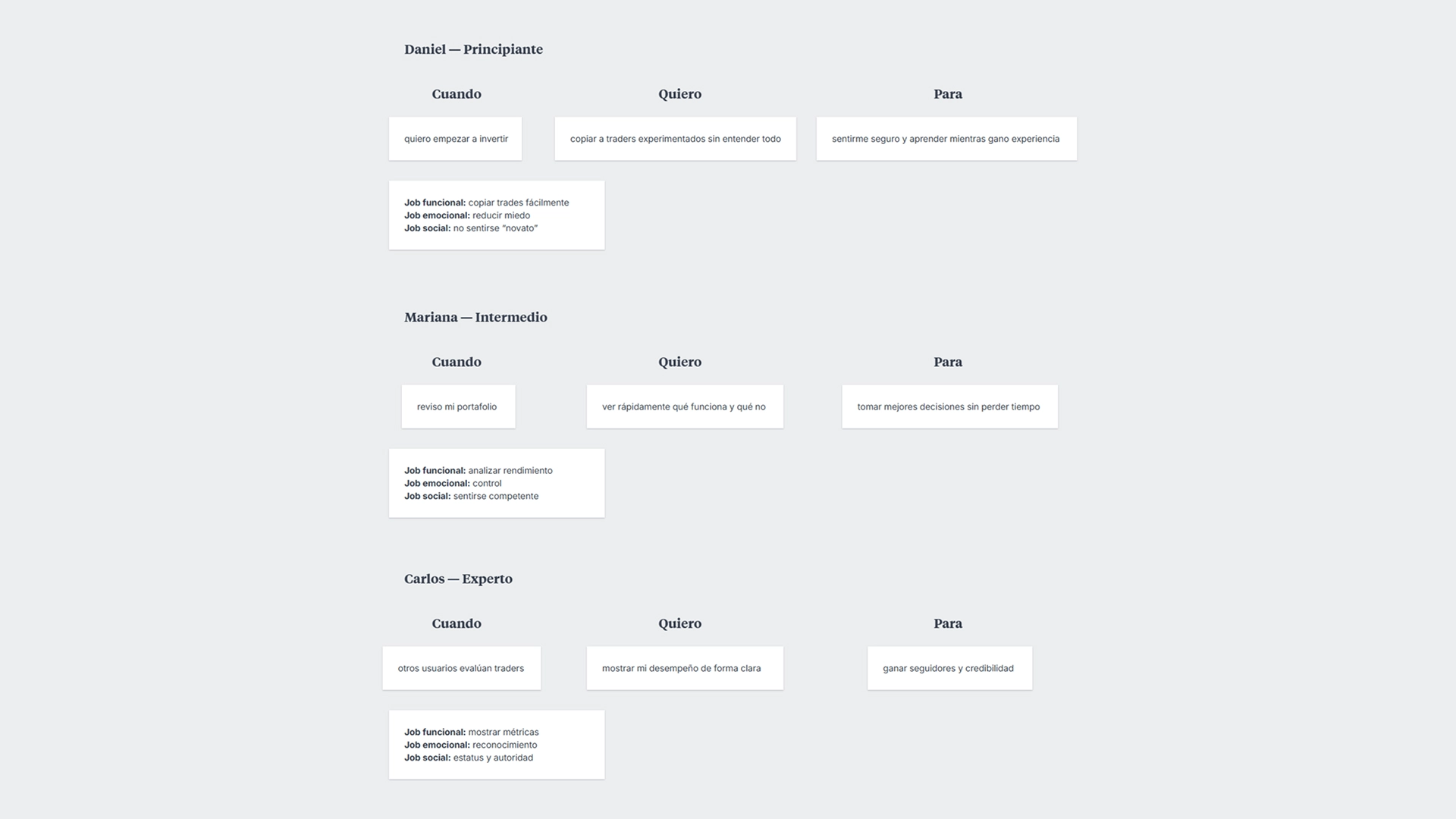
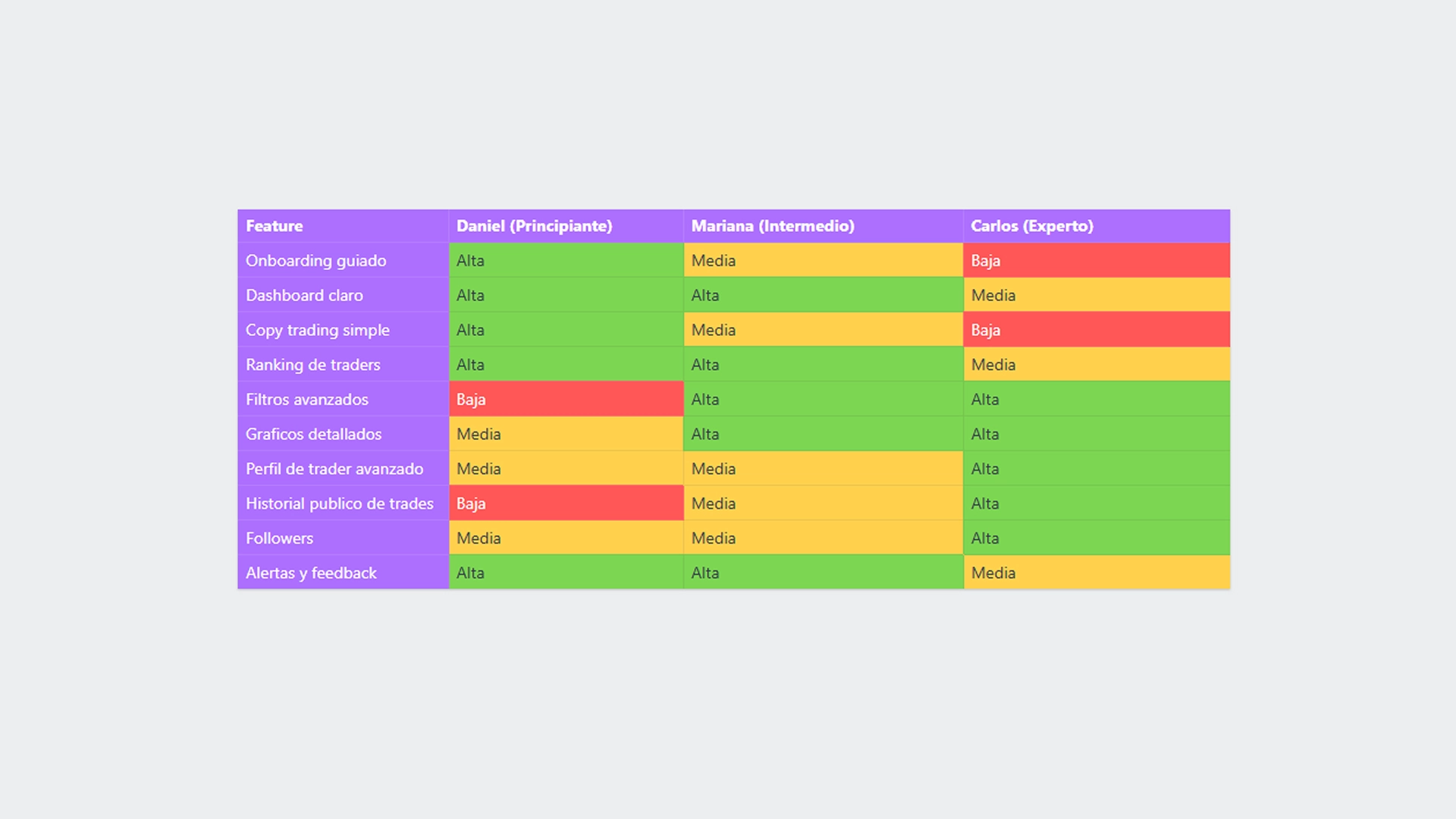
👤 Proto-Personas, Jobs To Be Done & Priority Matrix
I defined proto-personas based on qualitative research, benchmarking, and validated assumptions, representing the main user profiles for Trading Pal: beginner, intermediate, and expert.
For each profile:
• Jobs To Be Done (functional, emotional, and social) were defined.
• Real needs and motivations were mapped.
• A priority matrix was built to align features with impact for each user type.
This exercise allowed me to design a balanced experience that addressed adoption, retention, and community growth.
🔨 Previous interface — Initial state of the product
I documented the previous version of the app to identify visual limitations, hierarchy issues, and a lack of adaptation to full-screen devices.
These screenshots served as a reference for comparing the “before and after” state of the redesign, highlighting how the product did not take advantage of the new screen ratios or modern mobile design guidelines.
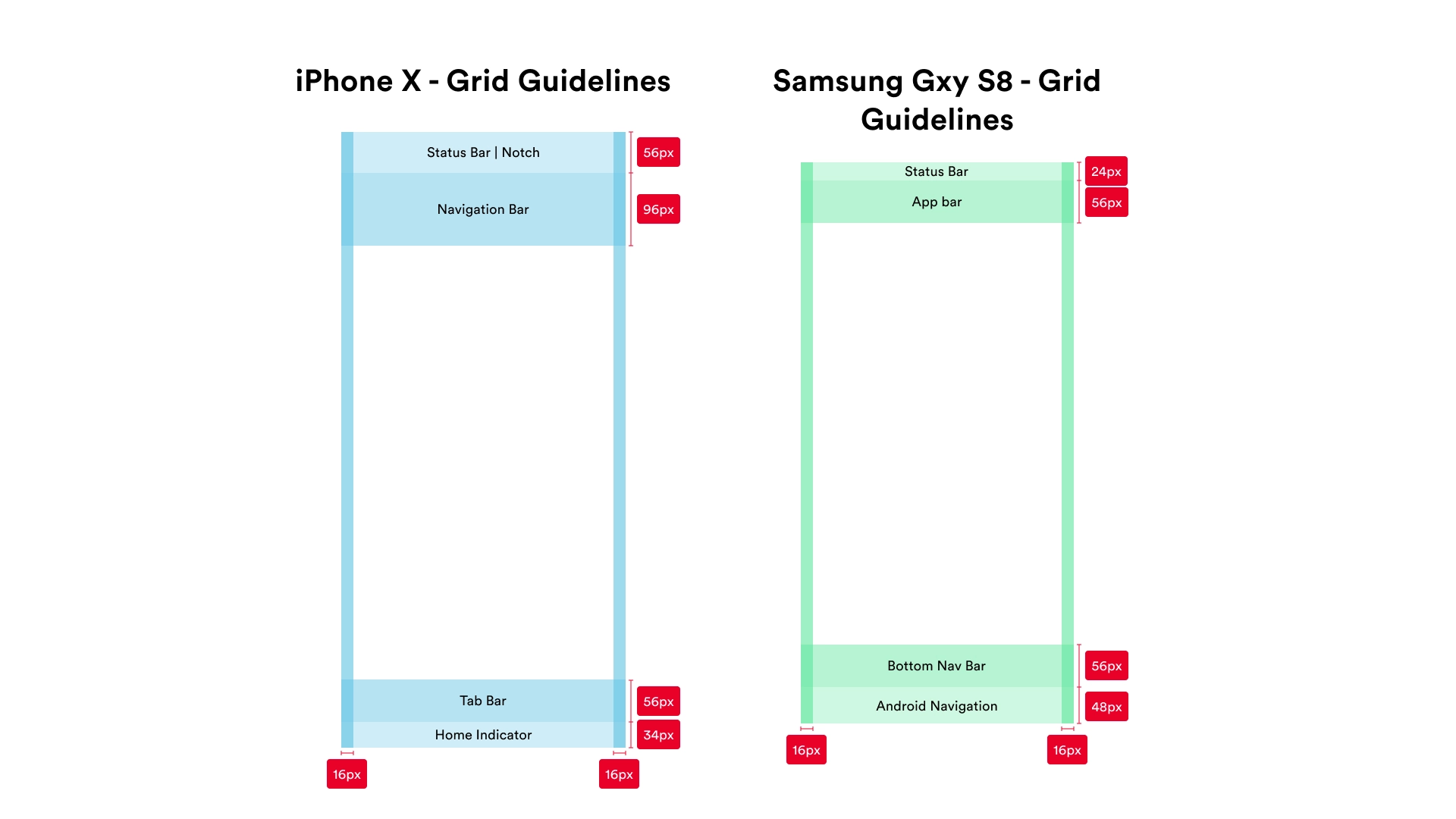
📐 Grid Guidelines — iPhone X & Samsung Galaxy S8
I studied the specific design guidelines and grids of the iPhone X and Samsung Galaxy S8, considering safe areas, notch, proportions, and native interaction patterns.
This analysis ensured that the redesign:
• Taked advantage of edge-to-edge space
• Respected safe areas
• Maintained consistency across platforms
Layed the technical groundwork for a modern, scalable design aligned with next-generation devices.
✏️ Crazy 8 — Rapid Idea Exploration
I used the Crazy 8 method to quickly explore multiple layout and visual hierarchy solutions.
The goal was to generate unconstrained ideas, focusing on how to redistribute critical information such as metrics, charts, and key actions within a full-screen experience.
This exercise allowed me to identify promising patterns before moving on to more structured wireframes.
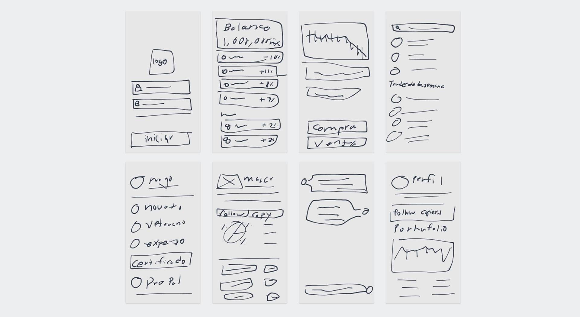
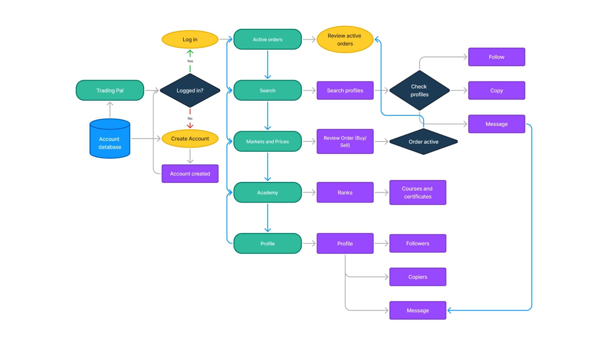
🛠️ Wireframes — Low-Fidelity
I created low-fidelity wireframes to define structure, navigation, and visual hierarchy without visual distractions.
These wireframes allowed me to validate key flows, relationships between sections, and content distribution before investing in visual design.
They were essential for iterating quickly and aligning the team on the experience architecture.
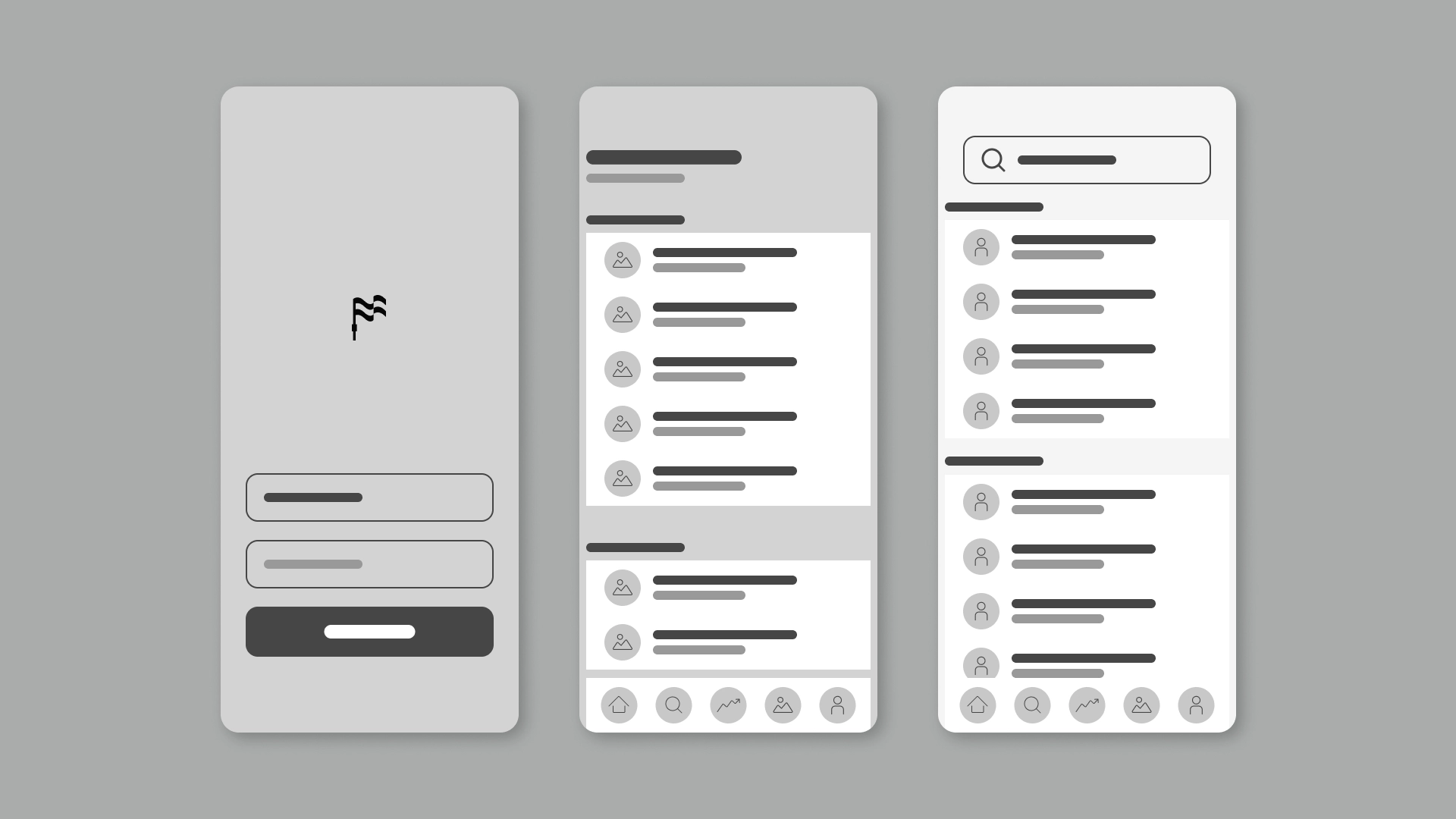
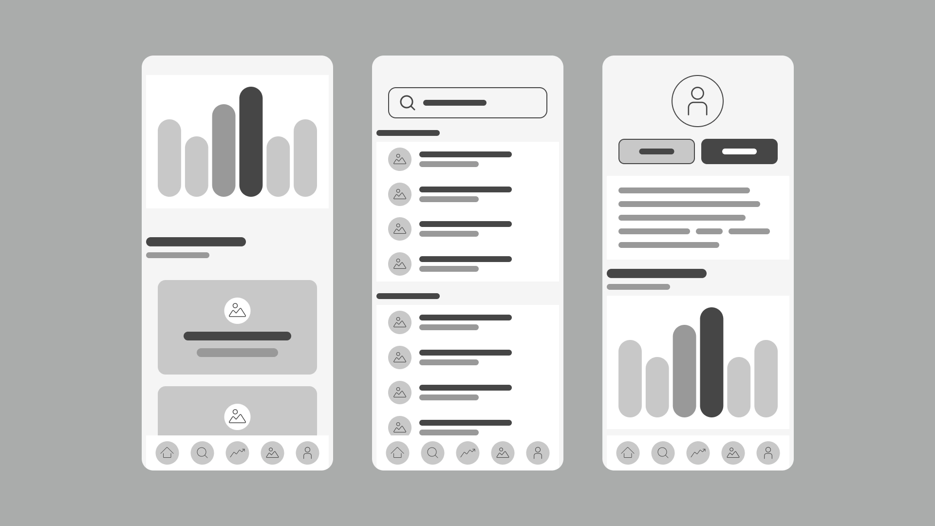
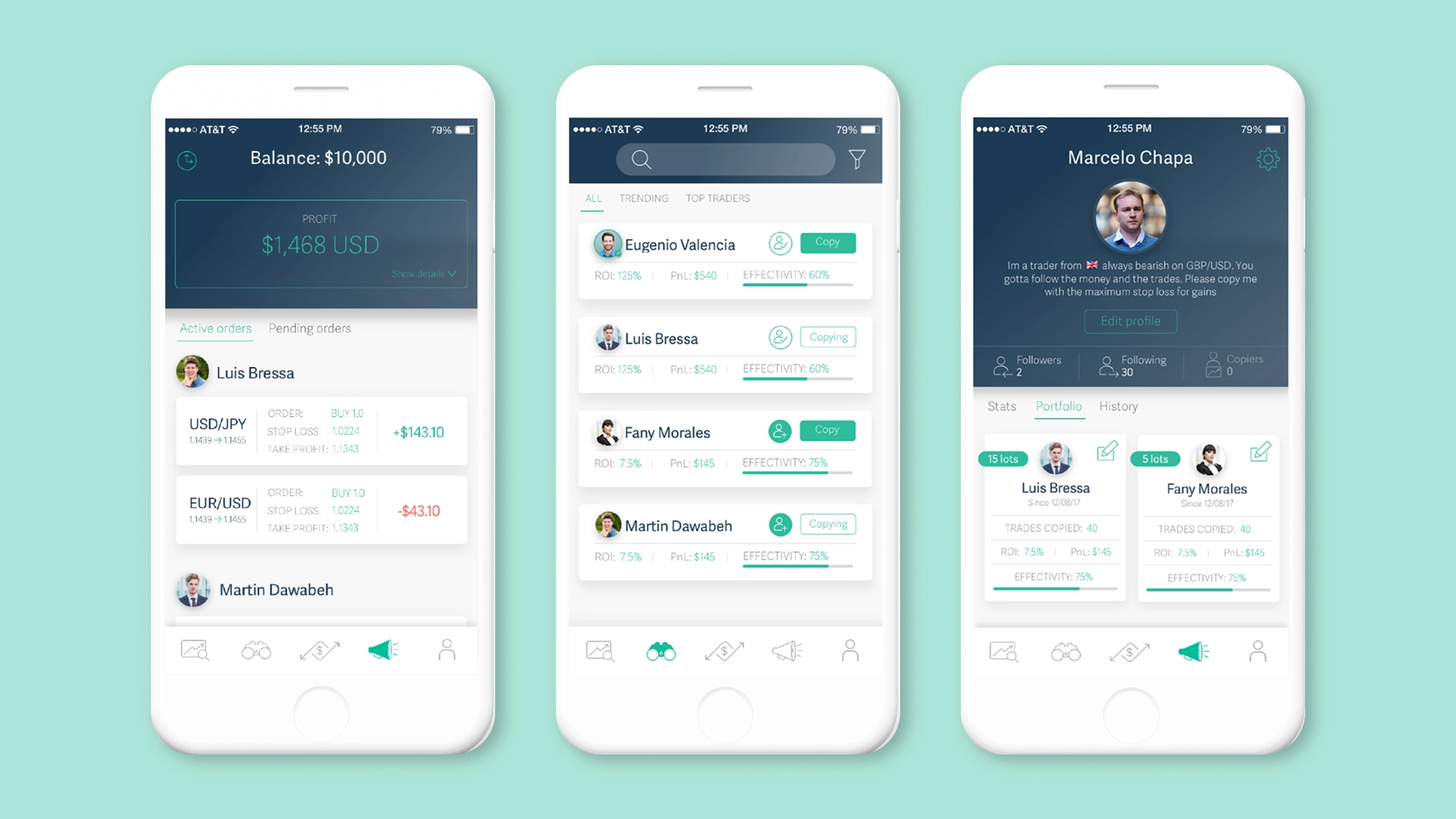
📱 Wireframes — High-Fidelity
🧪 User Testing & Validation
Once the Trading Pal redesign was finalized, we conducted usability testing sessions with our QA team, including profiles with varying levels of trading experience.
The tests focused on validating critical flows such as onboarding, trader exploration, copy trading, and the visualization of key metrics.
During the sessions, we observed clear improvements in:
• Understanding the interface
• Speed of completing tasks
• Confidence when executing financial actions
The feedback obtained allowed us to iterate on visual hierarchy, microcopy, and system feedback, confirming that the full-screen redesign not only modernized the app but also significantly improved usability and product perception.
This process validated the design decisions and ensured that the new experience met both business and user needs.