Rodan Logistics — Brand Identity
About
Our mission is to provide specialized logistics services that add significant value to our clients' supply chain. We understand that each business is unique, which is why we strive to offer tailored solutions that optimize logistics processes, reduce costs and improve operational efficiency.
Service
Brand Identity, Graphic Design, Mockups, Social Media.
Client
Rodan Company
Tools
Adobe Photoshop, Adobe Illustrator, Adobe After Effects, Jitter.
Website
🎨 About the Brand
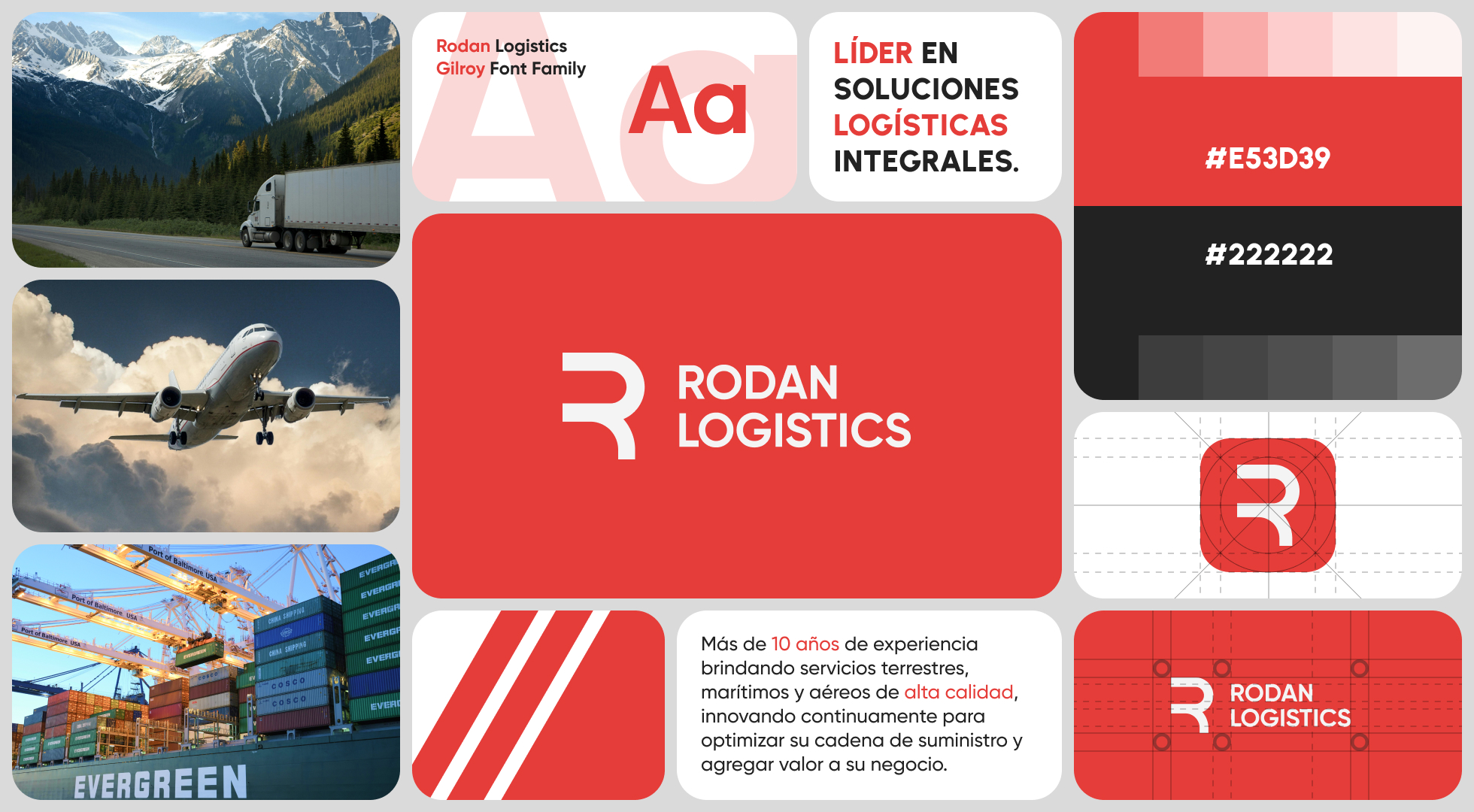
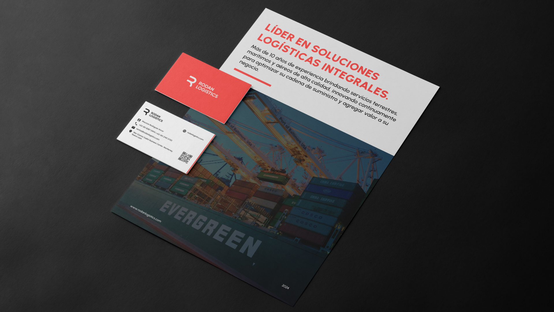
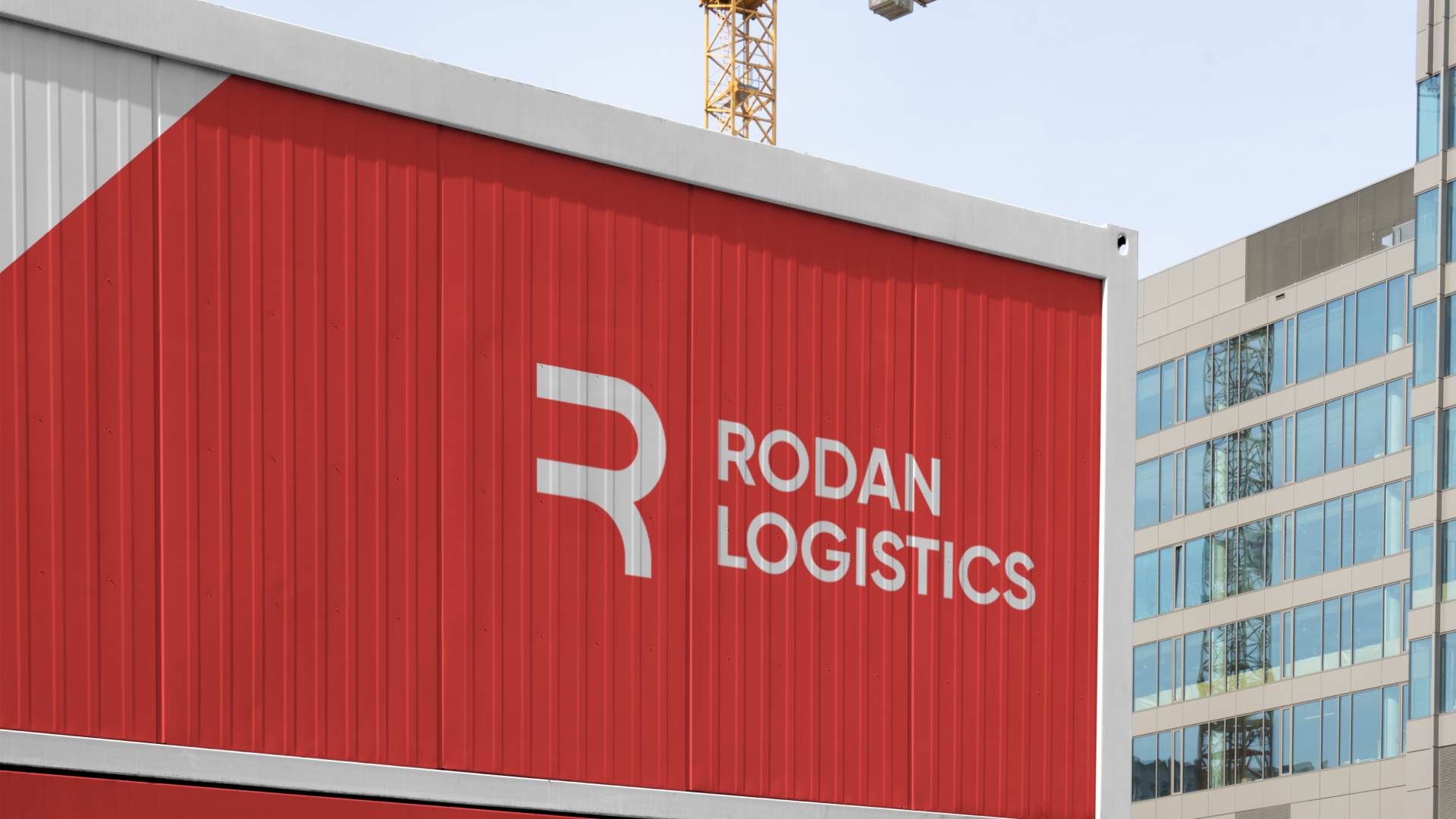
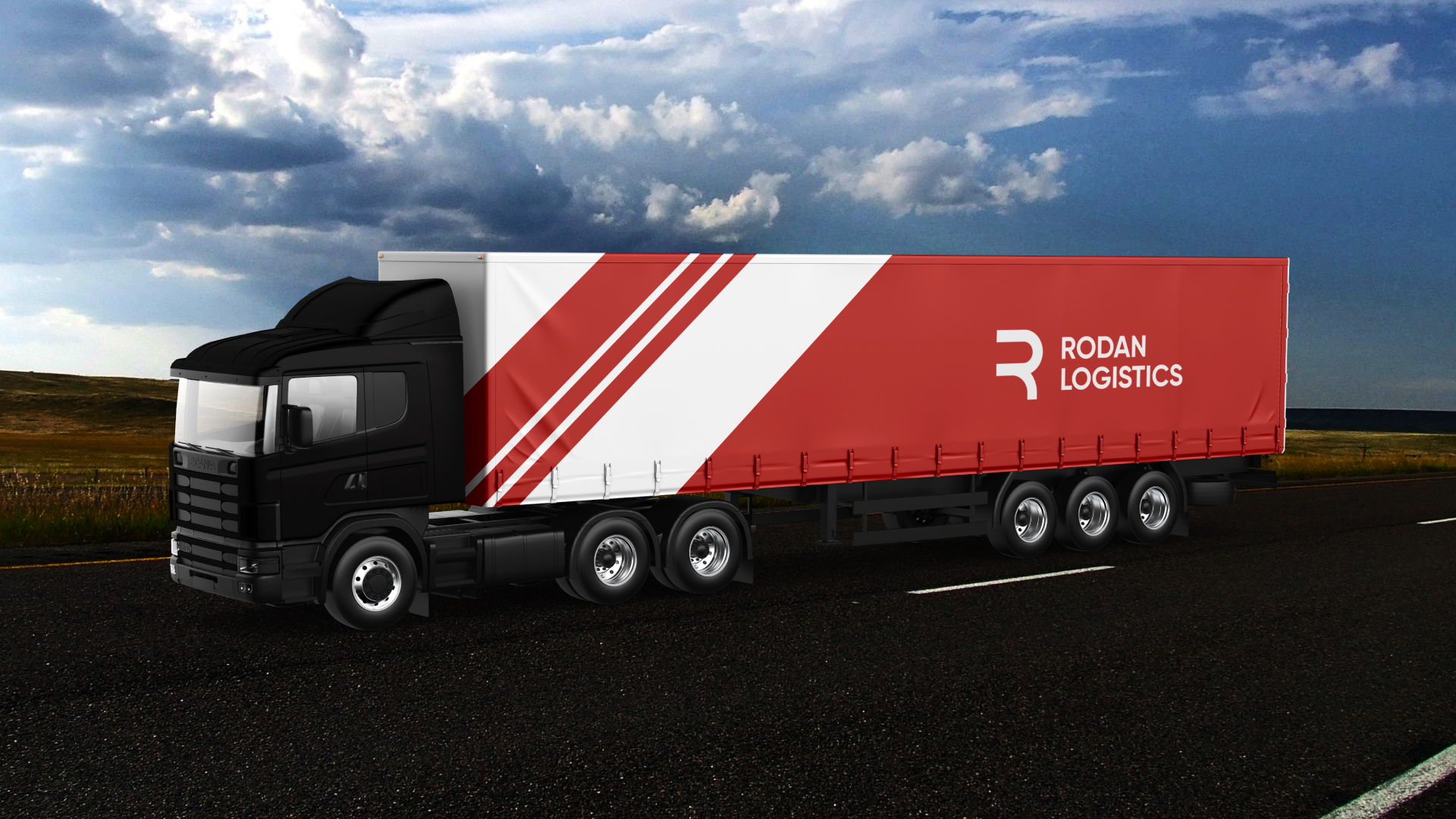
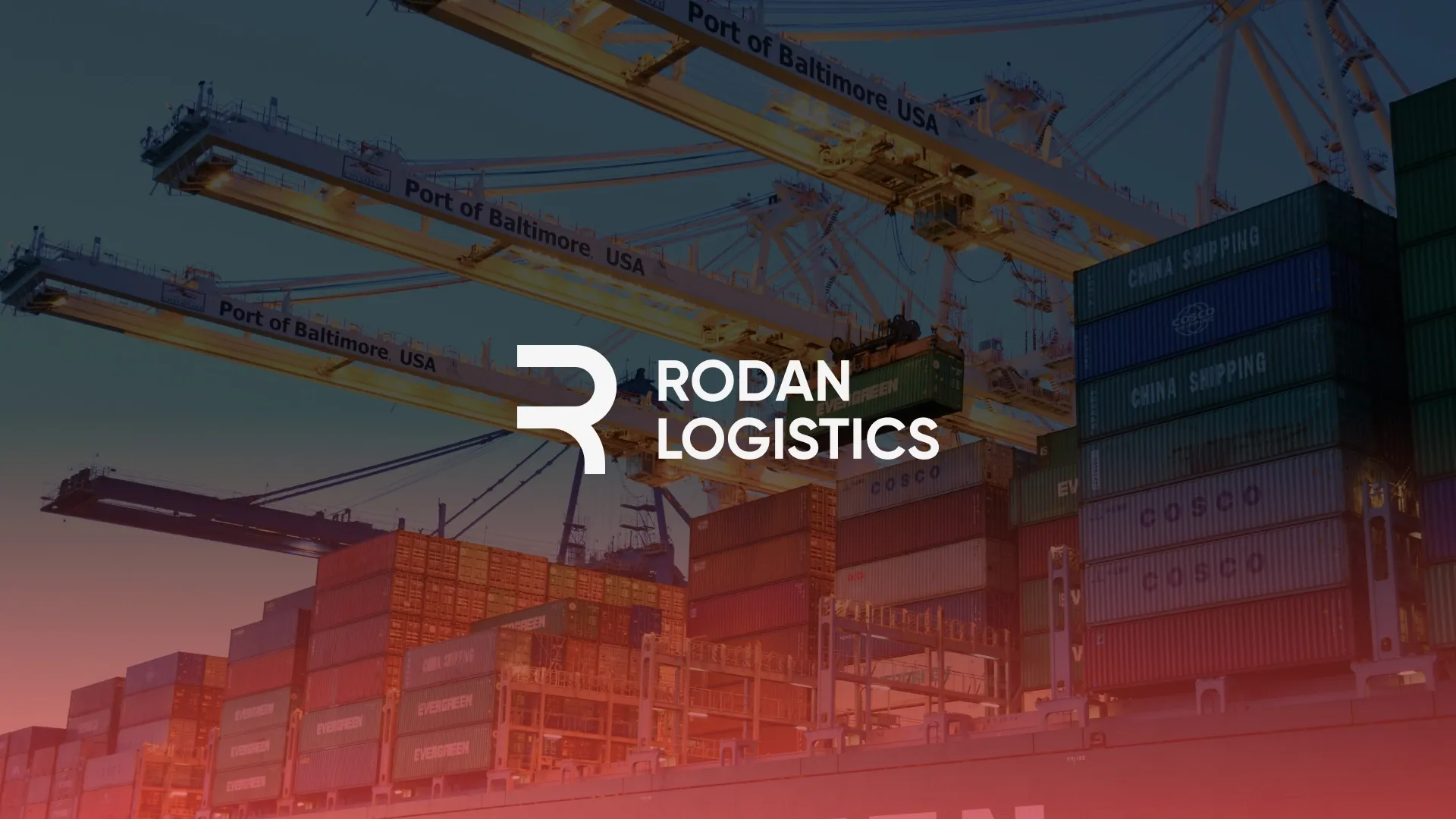
Rodan Logistics positions itself as a modern, dynamic, and reliable logistics company. The brand identity was designed to reflect efficiency, speed, and trust — key attributes in the logistics industry. Through a clean layout, bold color choices, and contemporary typography, the brand communicates a strong, competitive, and professional image.
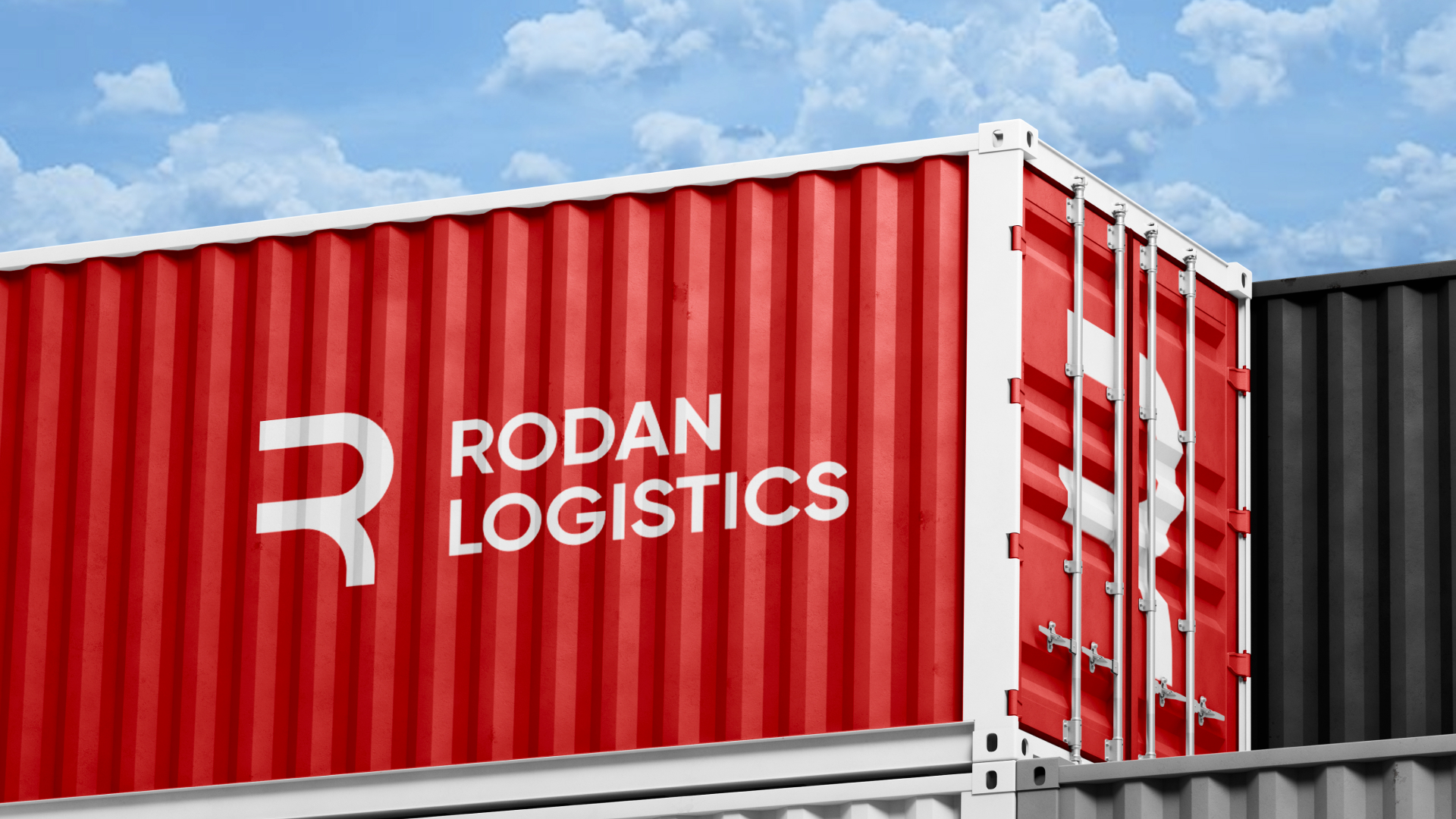
The logo design features a minimalist and stylized “R” paired with the company name, creating a mark that is simple, recognizable, and memorable. Its clean geometry conveys clarity, precision, and operational excellence, reinforcing Rodan’s positioning as a dependable logistics partner.
The color palette plays a key role in the brand personality. Red represents energy, movement, urgency, and confidence — essential values in fast-paced logistics operations. Black adds contrast, sophistication, and professionalism, balancing the vibrancy of red while enhancing visual hierarchy and readability.
The typographic system combines Gilroy and Urbanist, two modern sans-serif typefaces that ensure clarity, versatility, and visual consistency across digital and print platforms. Gilroy provides strong structure and impact for headings, while Urbanist supports body text and secondary content with excellent legibility and a contemporary tone. Together, they create a balanced, functional, and elegant typographic system.
Overall, the brand system is cohesive, flexible, and visually engaging. The strategic combination of color, typography, and layout creates a strong visual identity that supports usability, clarity, and brand recognition, delivering a modern and professional experience across all brand touchpoints.
![]()