Tiny Tina's: Wonderlands

About
Similar to its predecessors, the game is a first-person shooter with elements of an action role-playing game. The game can be played solo or with up to three other players in online or local split-screen multiplayer. The game is set within the world of a fantasy-themed tabletop role-playing game. The game features an overworld, which is used by the playable characters to traverse the various locations in the game. There are random combat encounters and quests that can only be completed in the overworld.
Service
Ux/Ui Design, Ui Implementation, Ui Development.
Client
CGBOT | DEVBOT, Gearbox Software, 2K Games.
Tools
Adobe Animate, Adobe Photoshop, Adobe Illustrator, Adobe After Effects, Rive, Coherent Labs, Unreal Engine, HTML, CSS, Javascript.
Team
Isaac Cardenas, Darey Hernandez
🔒 NDA Notice
This project was developed under a Non-Disclosure Agreement (NDA) with the studio and publisher. Due to confidentiality restrictions, I am unable to share internal design documentation, usability testing data, production assets, or proprietary workflows related to Tiny Tina’s: Wonderlands.
The information presented focuses on my role, responsibilities, design approach, and overall contribution to the project while respecting all confidentiality requirements.
🖥️ About — User Interface
The user interface (UI) design of Tiny Tina’s: Wonderlands has been carefully developed to offer players a visually appealing and functional experience. Through graphical elements, information layout, and intuitive controls, the game’s UI plays a crucial role in immersing players in the fantasy world of Tiny Tina.
The UI of Tiny Tina’s: Wonderlands features a vibrant and colorful visual style that reflects the game’s playful and fantastical tone. Graphical elements such as icons, buttons, and backgrounds are designed with attention to detail to capture the essence of Tiny Tina’s universe. Bright colors and eye-catching aesthetics help create a visually pleasing and engaging experience.
The layout of information on the screen has been carefully structured to provide clear navigation and facilitate player understanding. Menus and submenus are organized intuitively, allowing players to quickly access different options such as inventory, abilities, maps, and missions. Additionally, visual indicators and clear signage are used to highlight important information such as mission objectives, points of interest, and notifications.
Controls in the UI adapt to the different platforms on which the game is played, whether it’s consoles or PC. Buttons and commands are designed intuitively, taking into account the conventions of each platform to ensure a seamless and smooth gaming experience. Additionally, customization options are provided to allow players to adjust controls according to their individual preferences.
The UI of Tiny Tina’s: Wonderlands combines eye-catching visual style, clear information layout, and intuitive controls to provide players with an immersive and satisfying gaming experience. The careful design of the UI helps players navigate the game world, access options, and perform actions efficiently, thereby delivering a seamless and exciting gaming experience.
🔄 UI Process — Day to Day Workflow
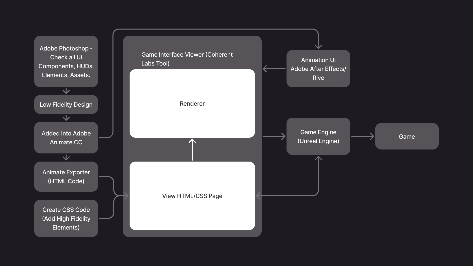
We received the entire UI in a Adobe Photoshop file, where we could review how it was built — from components, icons, and HUD elements to all related guidelines. Each element was organized and documented to support a process called 9-Slicing (which I’ll explain later).
Our first step was to carefully analyze the full UI structure, separate its elements, and recreate a low-fidelity design in Adobe XD. This allowed us to understand how each component was composed and ensure that no visual or functional elements were missing.
Once we had the components defined, we imported everything into Adobe Animate, where we prepared the assets for export to HTML using Coherent Labs’ internal plugin.
After exporting, we used Gameface by Coherent Labs to preview and implement the UI. This stage involved assembling all HUDs and components using their respective patterns and sizes (9-sliced scaling). We applied responsive techniques — including min-width and max-width breakpoints — to ensure that each component scaled dynamically with its internal content, particularly the text.
For animations, we worked in Adobe After Effects, exporting the motion assets to be integrated directly into Gameface, where we could manipulate and test them further.
Finally, once everything was verified for accuracy and consistency, we performed the final toggling and integration into Unreal Engine, ensuring that all UI elements behaved correctly within the game environment.
⬛ 🟪 9-Slicing — UI Process
9-Slicing is a technique used in UI design —especially in video games, applications, and responsive systems— to scale images or components without distorting their edges or corners.
Imagine you have a button with rounded corners or a panel with a texture. If you simply scale the entire image, the edges get stretched or lose their proportions. 9-Slicing prevents that.
How does it work?
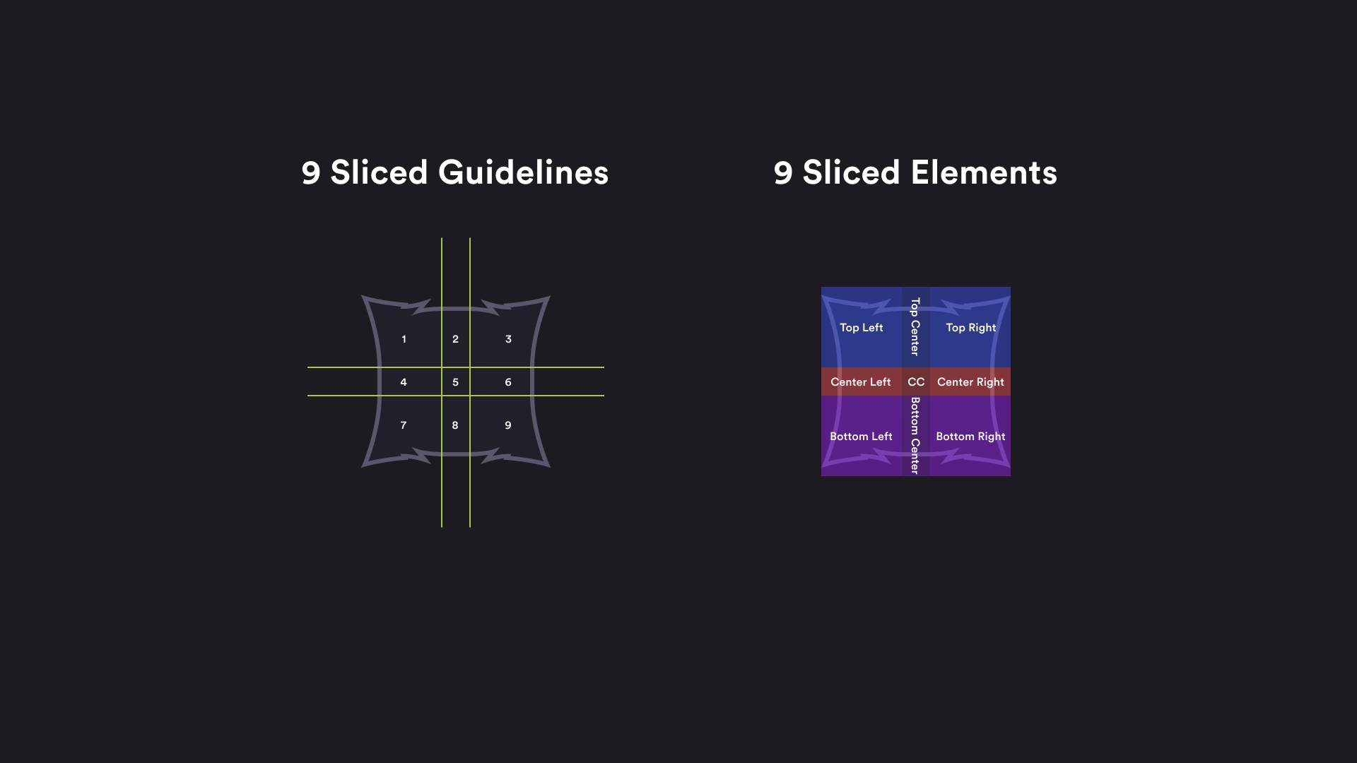
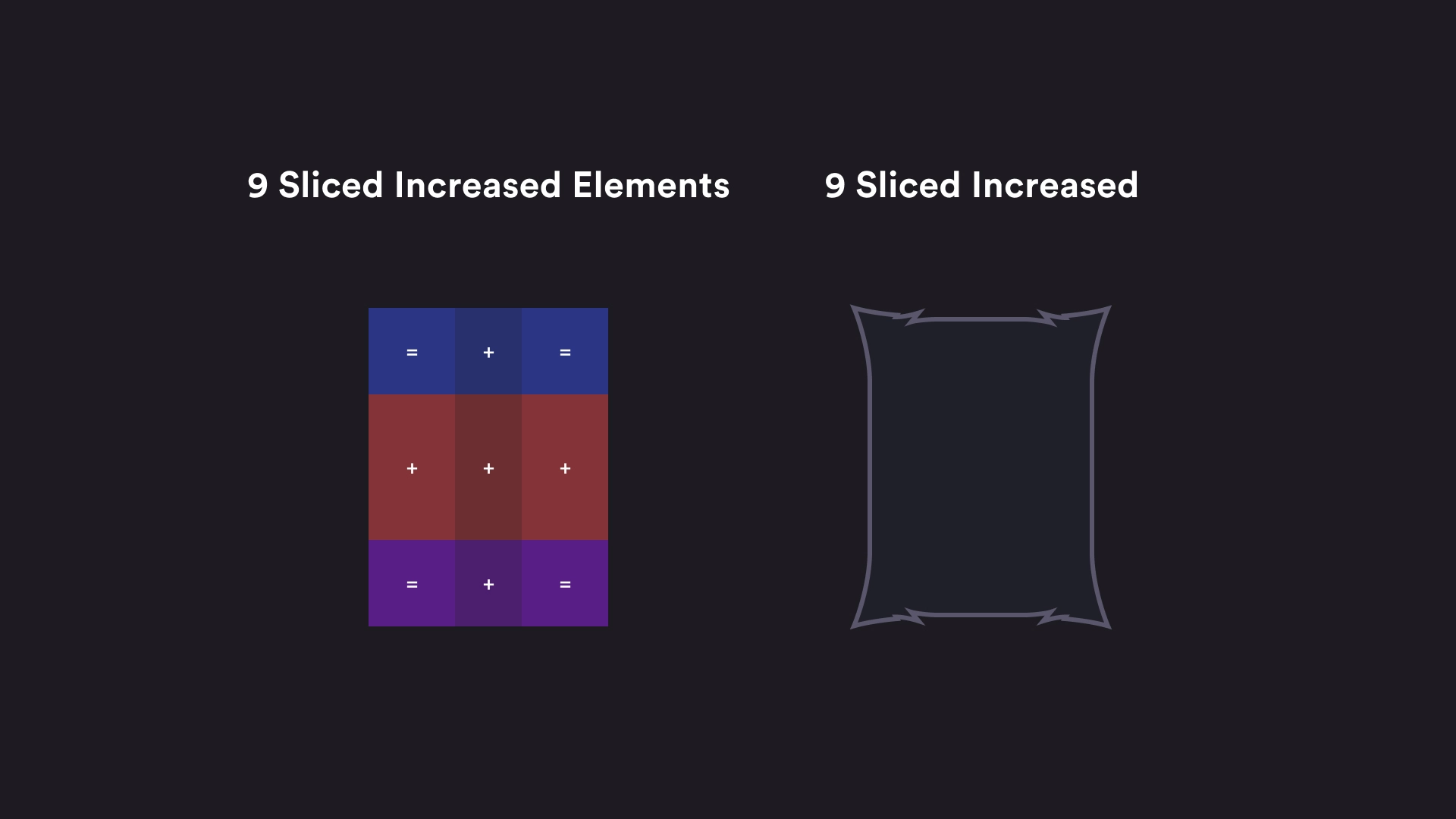
The image or component is divided into a 3x3 grid, creating nine sections:
• Corners (1, 3, 7, 9): These remain unchanged — they keep their original size to preserve rounded edges or detailed textures.
• Edges (2, 4, 6, 8): These are scaled only in one direction (horizontal or vertical).
• Center (5): This is the only area that scales freely to adjust to the component’s total size.
This way, you can make a button, card, or panel grow or shrink without losing visual quality or distorting its design.
Video games: For HUDs, menus, buttons, and dialogue boxes that need to adapt to different text lengths or screen sizes.
Applications: In systems that require responsive or dynamic components that adapt to content without redesigning them.
Game engines: Tools like Unity, Unreal Engine, or Coherent Labs Gameface use this technique to scale UI elements in real time.
A button with rounded corners is divided into 9 slices.
When the button is resized:
• The corners remain intact.
• Only the center and edges stretch.
This allows for flexible and reusable components, which are essential in a modular design system or scalable UI.
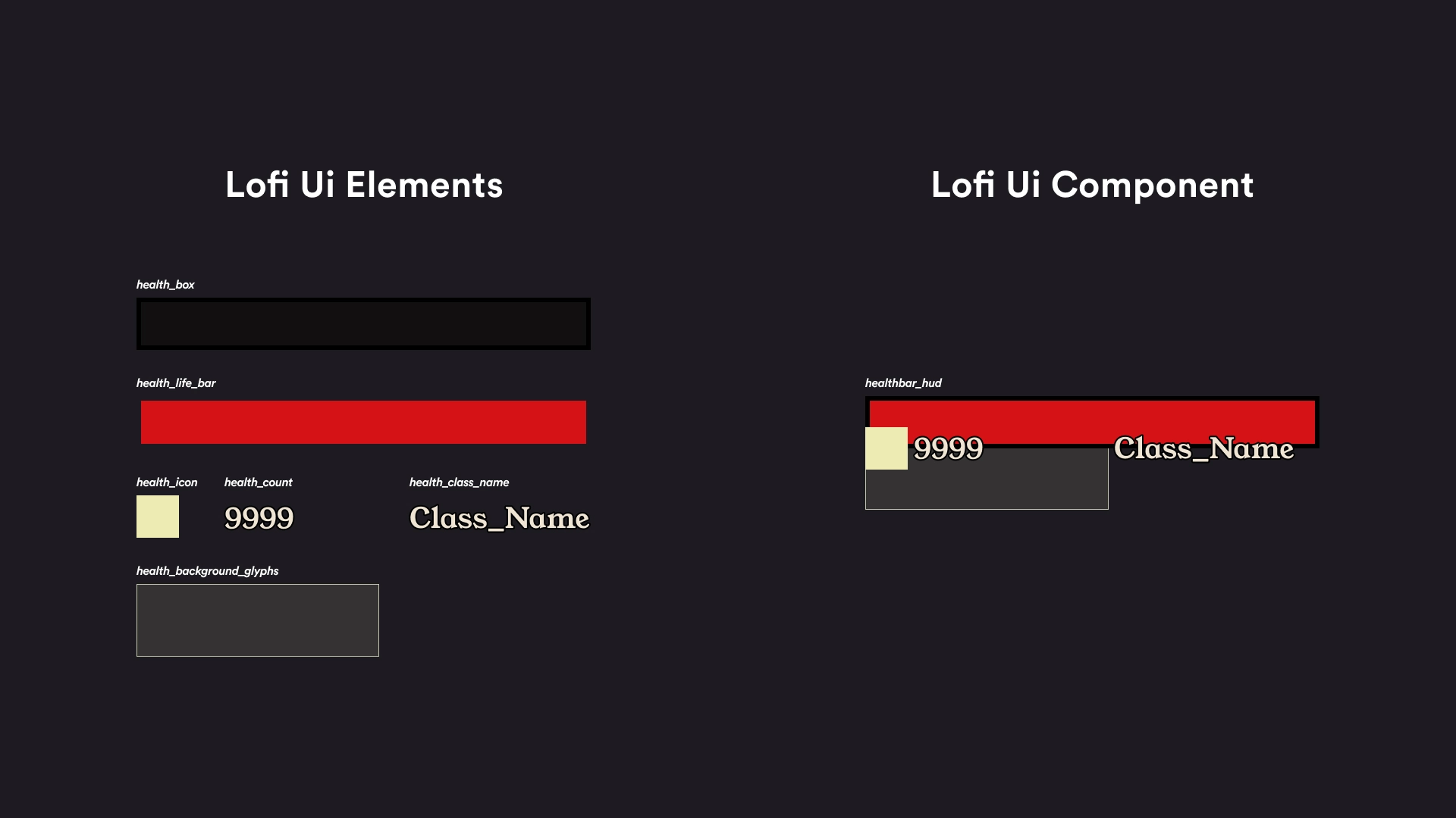
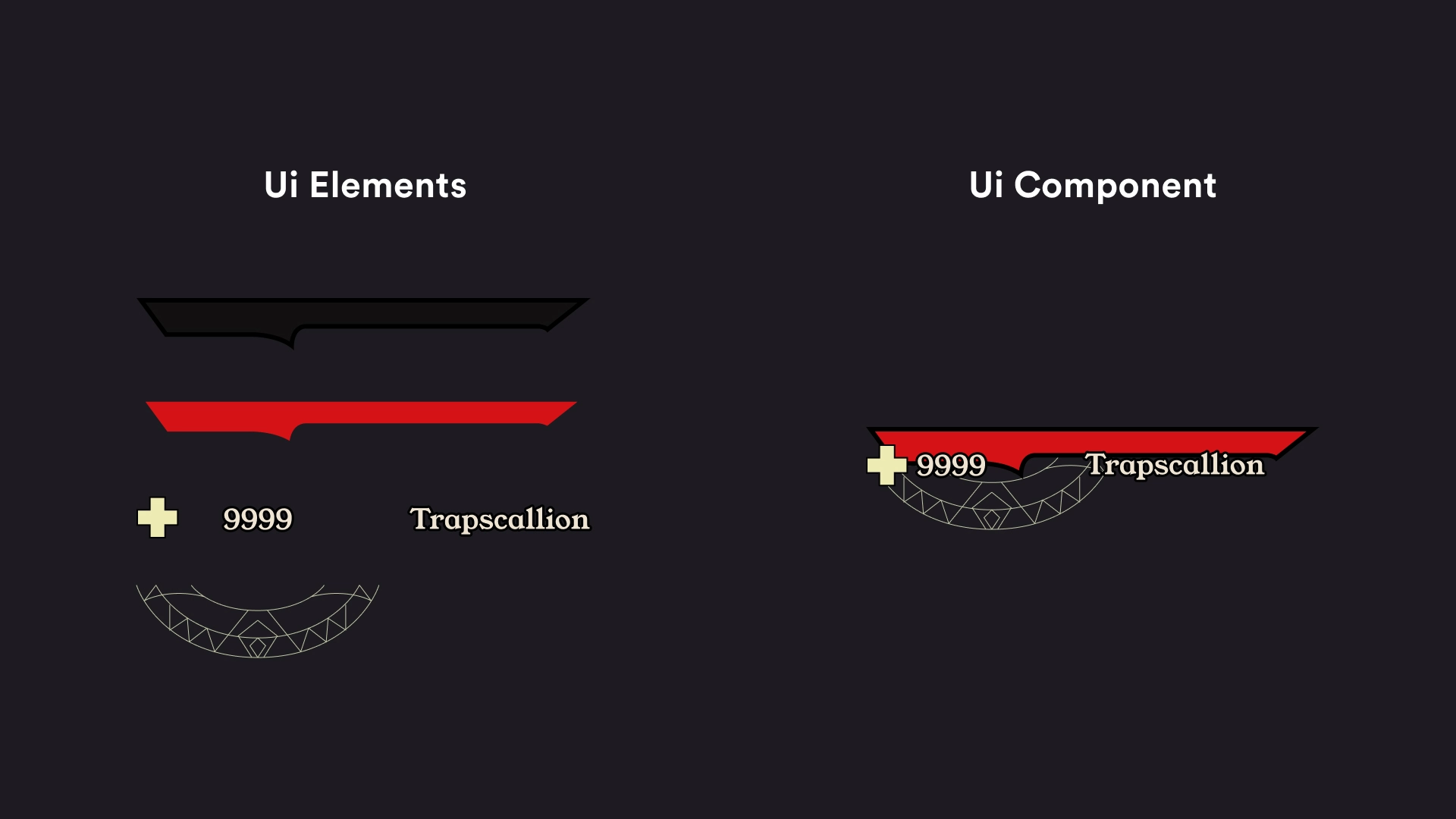
🛠️ Building — UI Components
Note: This are just examples, this is was not taken from the original Tiny Tina’s: Wonderlands Ui.
