Corgee - Ux/Ui Website Design
Corgee is a comprehensive tasks management and communications tool designed to streamline team management both internally and externally. With our proprietary milestone cards, users can easily track performance and deliverables, ensuring projects stay on schedule.Our platform simplifies communication and tracking by providing a centralized location for team members, publishers, and vendors. Users can set up the entire infrastructure for communication and tracking effortlessly.
One of Corgee's standout features is its customizable layers and security groups, allowing users to control who has access to specific information. This unique functionality ensures that vendor and internal data can coexist within the same thread, covering assets, contracts, vendor evaluations, developmental milestones, and internal commentary.
Corgee also offers a range of additional features including dashboards, automatic databases, reports, and chat capabilities, providing users with a comprehensive solution for managing tasks and facilitating communication within their teams.
User Journey
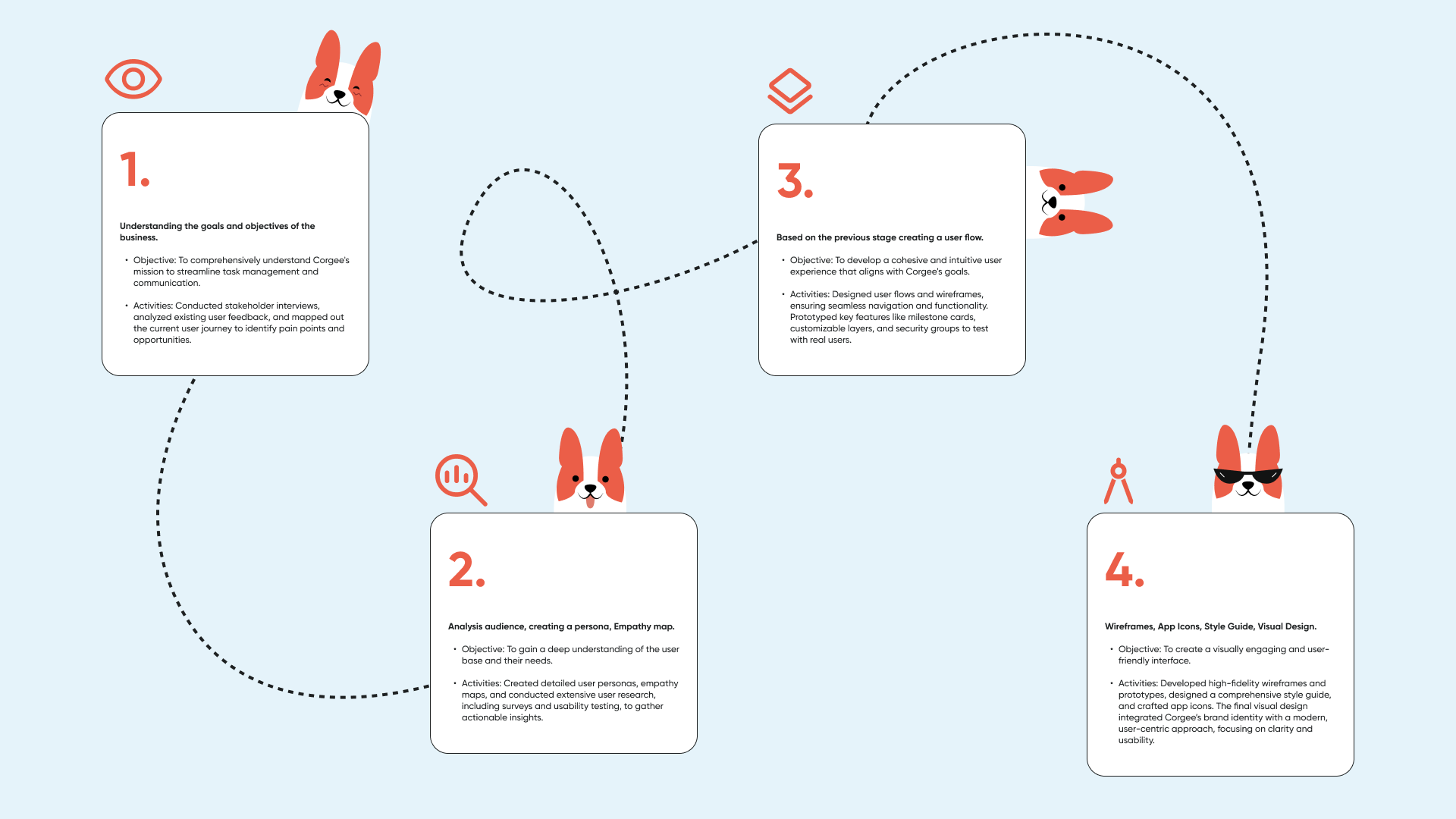
Our redesign of Corgee’s website was driven by the principles of Design Thinking, ensuring a user-centric approach at every step. The goal was to craft an enhanced experience for our users by focusing on their needs, preferences, and behaviors.
1-Assessment of Project Activities
We began by understanding the goals and objectives of Corgee, aligning them with user expectations to identify key areas for improvement.
2-Research
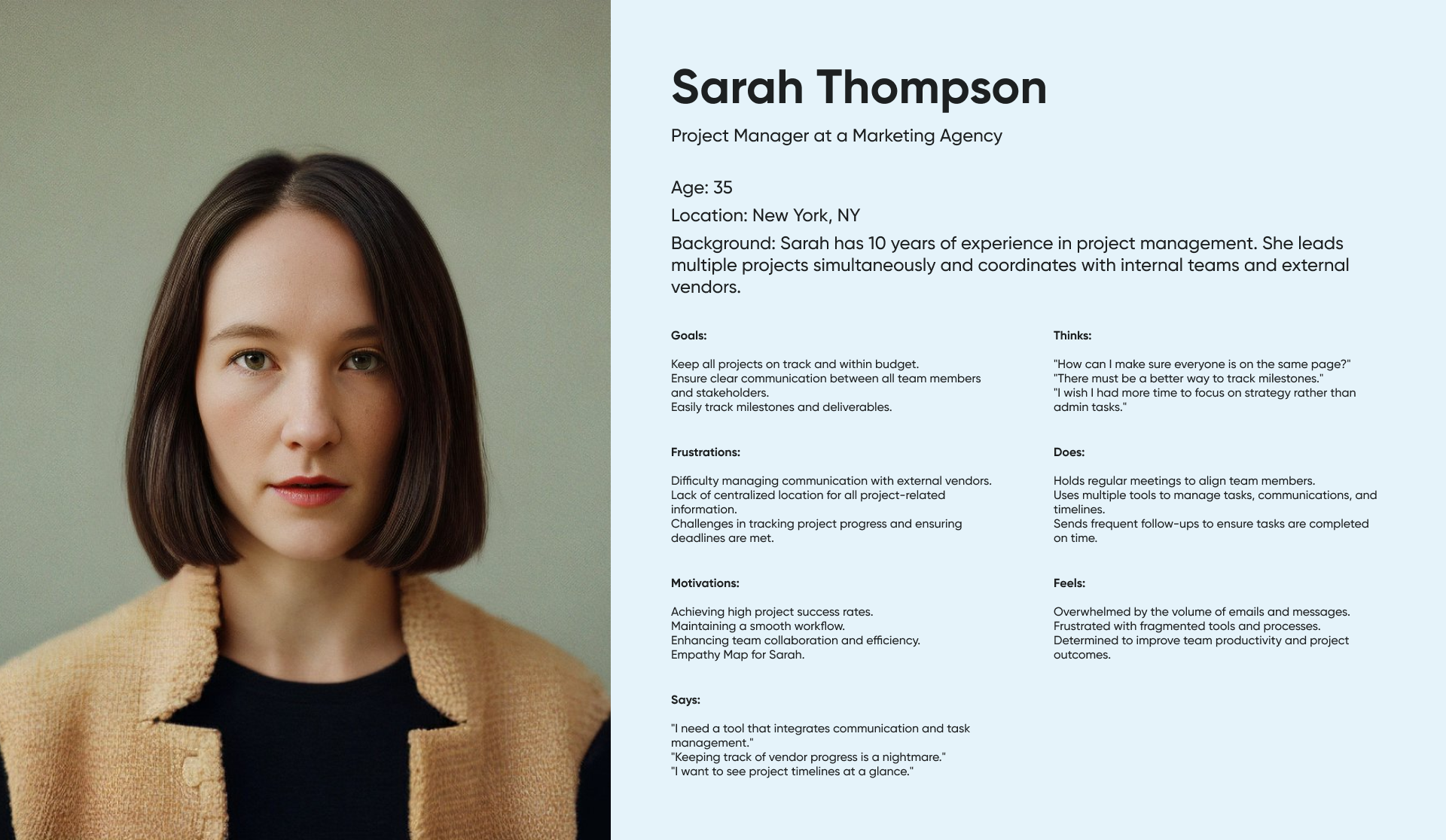
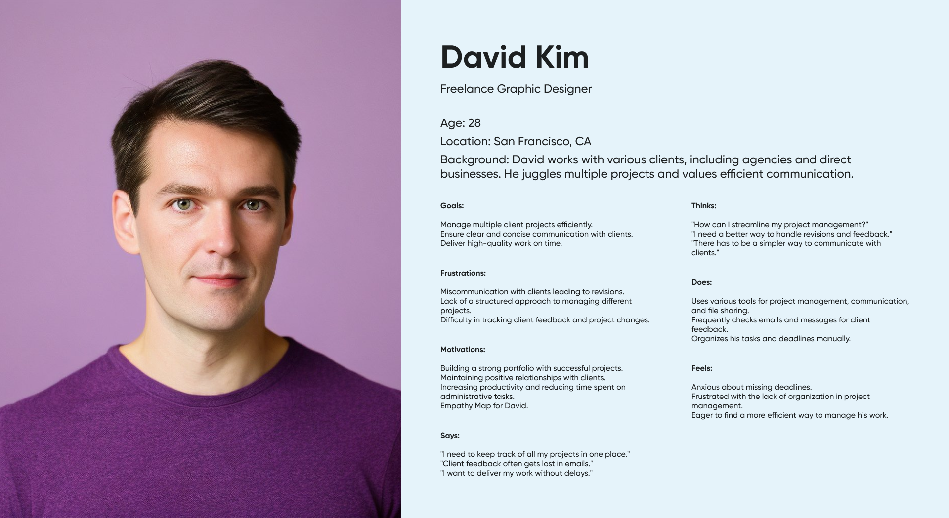
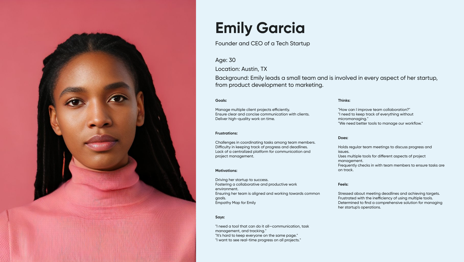
Through extensive audience analysis, persona creation, and empathy mapping, we gained deep insights into our users. This research phase was critical in uncovering user pain points and opportunities for innovation.
3-Development of Functionality
Based on our research, we developed a user flow that ensures intuitive navigation and seamless interactions. This stage involved creating detailed wireframes and prototypes, iterating on designs to enhance usability and engagement.
4-Design
The final design phase brought our vision to life with visually appealing interfaces, consistent style guides, and responsive design elements. We focused on creating a cohesive and aesthetically pleasing experience that balances functionality with visual delight.
Persona
Brand elements
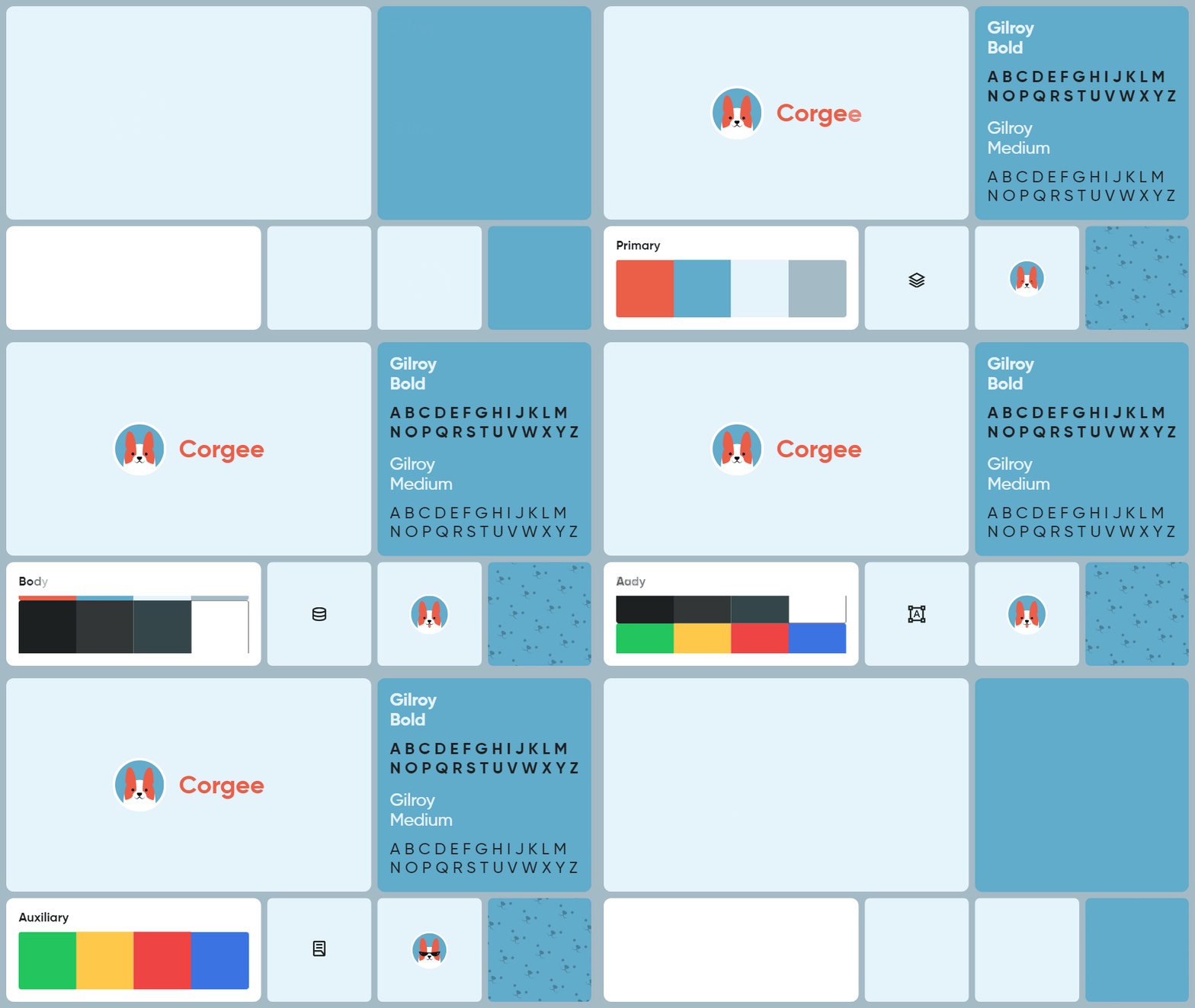
At Corgee, design isn’t just about aesthetics; it’s about creating an immersive and intuitive experience for our users. Our design philosophy revolves around the seamless integration of typography, color, icons, and brand imagery to convey our message effectively.
Typography: We use the clean and modern Gilroy bold and medium fonts to ensure readability and consistency across our platform. This choice reflects our commitment to clarity and professionalism.
Color Palette: Our main palette colors, including Orange fur, Air blue, Glacier blue, and Rock Blue, evoke a sense of energy, trust, and reliability.
Complemented by our secondary palette colors and auxiliary palette colors for success, warning, danger, and informative states, our color scheme adds vibrancy and visual hierarchy to our design elements.
Iconography: Icons play a crucial role in expressing the diverse range of services we offer. From project management to communication tools, our carefully crafted icons enhance user understanding and navigation, making interactions intuitive and dynamic.
Brand Identity: The Corgee logo icons serve as a focal point of our brand identity, symbolizing our commitment to innovation and creativity. These icons reinforce our brand image, infusing a cheerful and playful spirit into our design elements.
Background Patterns: Our distinctive isometric patterns featuring the friendly face of Corgee add depth and character to our backgrounds, whether in print or digital. These patterns inject life and personality into our design, creating a visually engaging environment for our users.
In essence, our design approach at Corgee is rooted in functionality, coherence, and delight. By integrating typography, color, icons, brand imagery, and background patterns, we strive to create a captivating and user-centric experience that embodies the essence of our brand.
Corgee Website Redesign

Functionality and ease of use come together to give you an exceptional experience. From the first moment you arrive on our page, you are immersed in an environment carefully designed to meet your needs and provide you with intuitive navigation.
Our website has been designed with you, the user, in mind. Every element, from the layout of the menus to the choice of colors and typography, has been selected with the aim of ensuring a smooth and pleasant browsing experience.
The structure of the website has been designed so that key information is easily accessible. Calls to action are highlighted clearly, allowing you to take important actions quickly and easily.

Navigation is effortless thanks to the logical arrangement of elements and the clarity of the information presented. Intuitive drop-down menus and icons guide you naturally through the page, making it easy to find the information you need.
Our website also adapts perfectly to any device, whether you are browsing from your desktop computer, tablet or mobile phone. This ensures a consistent and satisfying experience, regardless of the device you use.

Corgee offers a seamless user experience, where functionality, accessibility and aesthetics combine to provide you with an exceptional browsing experience. Explore our features, learn more about our services, and discover how Corgee can help you optimize your task management and communication processes.

