CookMX — Brand Identity
About
Whether you're looking for an everyday meal or planning a special event, CookMX has you covered. We provide specialized catering for weddings, parties, and other events, ensuring that every occasion is complemented by our top-notch culinary creations. Our extensive range of dishes is crafted in-house, ensuring a gourmet touch in every bite.
Service
Brand Identity, Graphic Design, Mockups, Social Media.
Client
CookMX
Tools
Adobe Photoshop, Adobe Illustrator, Adobe After Effects, Adobe Lightroom, Jitter.
Collaboration
🎨 About the Brand
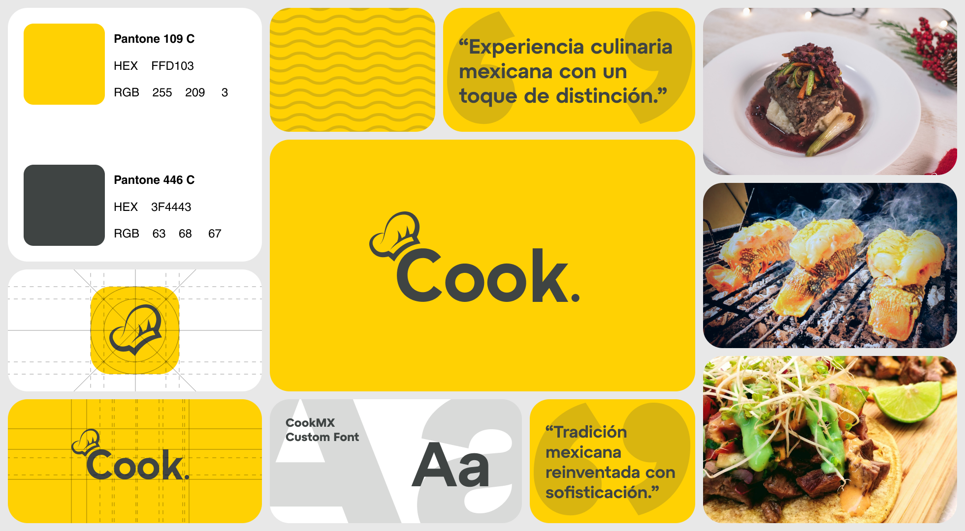
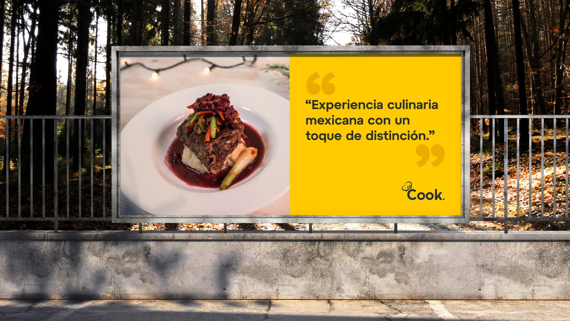
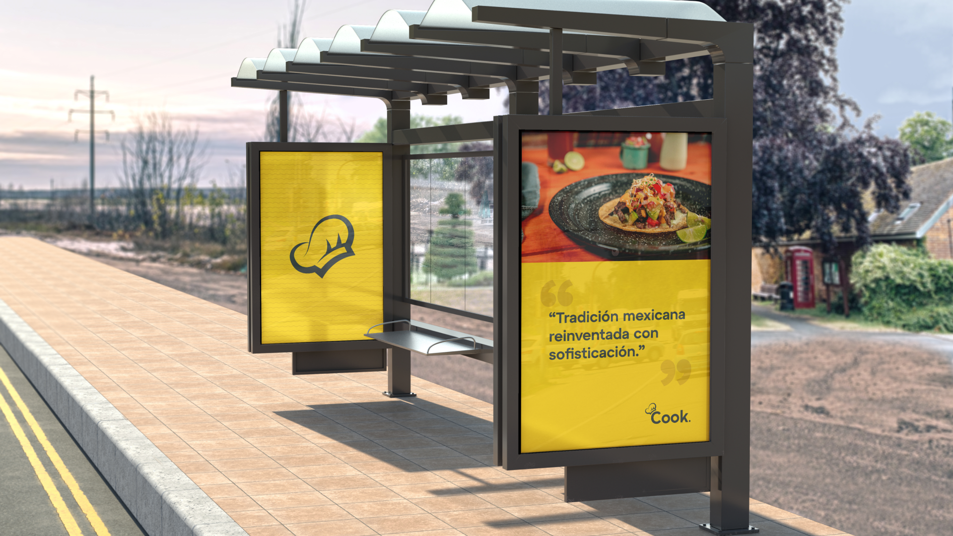
The brand identity was designed to reflect this balance through a clean, elegant, and expressive visual system that communicates quality, creativity, and professionalism.
The logo features a minimalist chef’s hat icon, symbolizing culinary expertise, precision, and craftsmanship. Its clean geometry and balanced proportions convey attention to detail and high production standards. The typography complements the icon with a bold, modern sans-serif typeface that projects clarity, confidence, and accessibility. The subtle dot at the end of “Cook.” adds a distinctive and playful accent, reinforcing the brand’s meticulous and creative spirit.
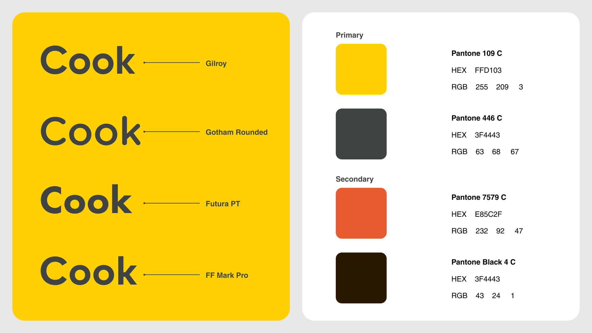
The color palette combines vibrant yellow (Pantone 109 C) and deep charcoal gray (Pantone 446 C). The yellow represents energy, warmth, creativity, and the richness of Mexican culture, while the charcoal adds sophistication, balance, and elegance. Together, they create a strong visual contrast that enhances brand recognition and communicates a premium yet approachable personality.
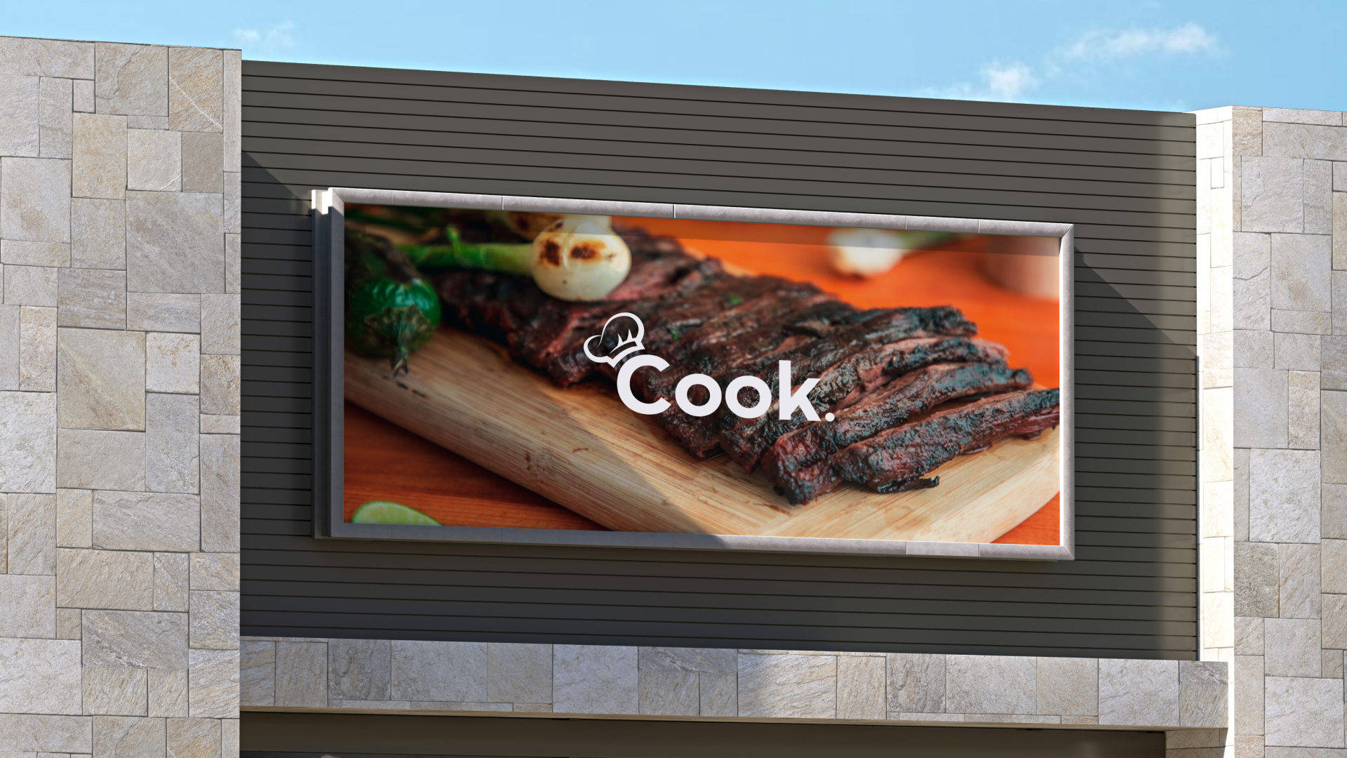
Custom typography was developed to ensure consistency, readability, and adaptability across digital and print platforms. The imagery direction focuses on highlighting high-quality ingredients, refined plating, and the diversity of Mexican cuisine, reinforcing the brand’s gourmet positioning.
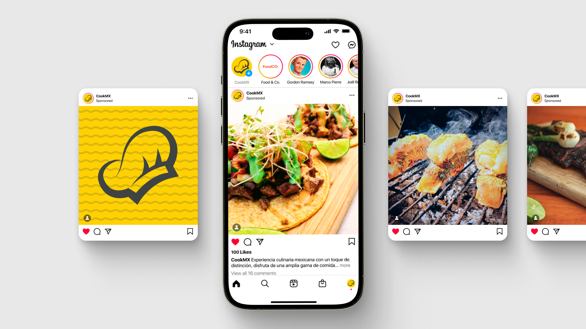
This project included a collaboration with independent photographer Recna, who contributed high-quality food photography, helping elevate the visual narrative and strengthen CookMX’s premium brand perception.

