Boy Scouts Toolbelt — Design System
About
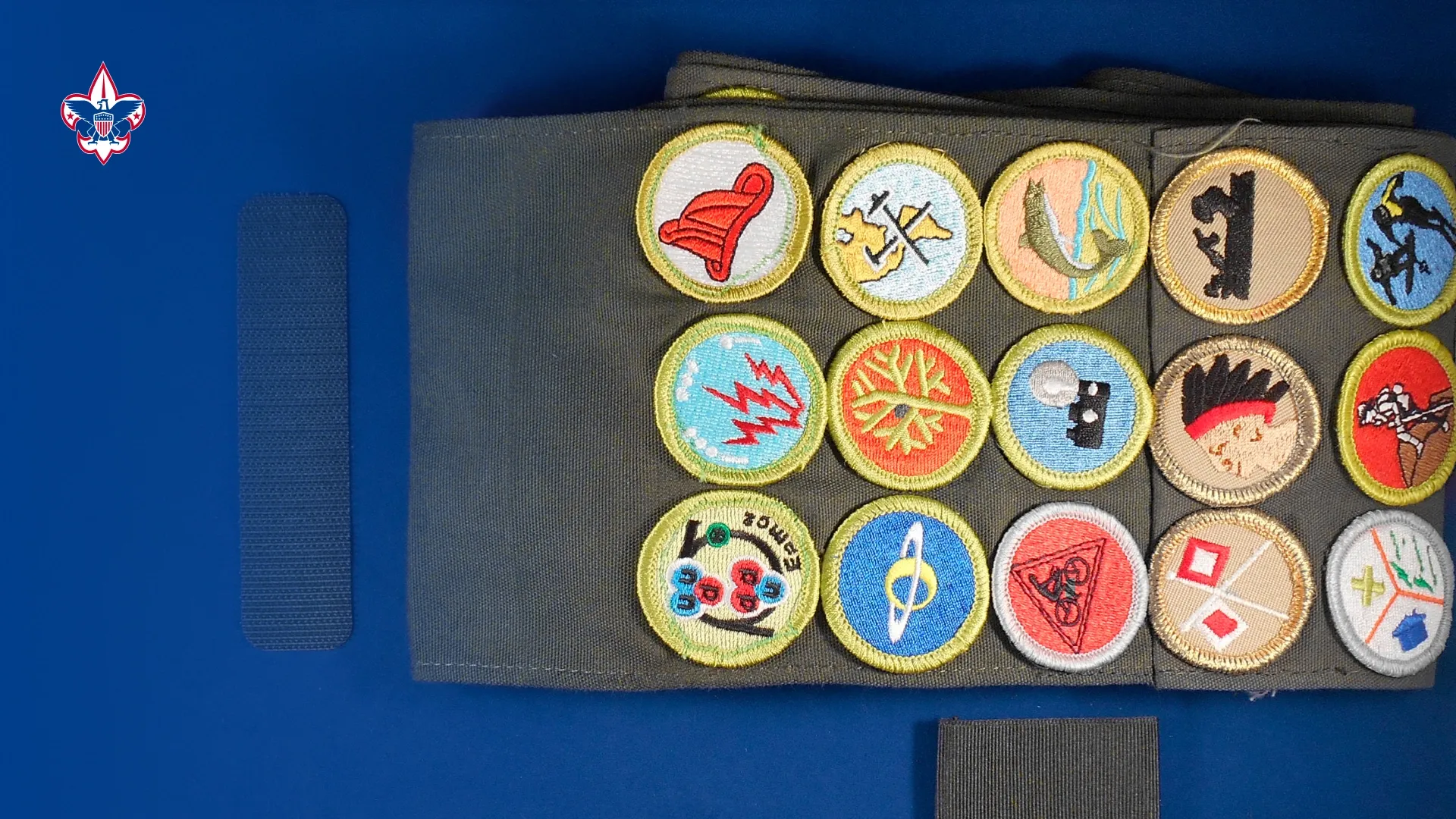
The stated mission of Scouting America is to "prepare young people to make ethical and moral choices over their lifetimes by instilling in them the values of the Scout Oath and Law". Youth are trained in responsible citizenship, character development, and self-reliance through participation in a wide range of outdoor activities, educational programs, and, at older age levels, career-oriented programs in partnership with community organizations. For younger members, the Scout method is part of the program to instill typical Scouting values such as trustworthiness, good citizenship, and outdoors skills, through a variety of activities such as camping, aquatics, and hiking.
To further its outdoor activities, Scouting America owns four high adventure bases Northern Tier (Minnesota, Manitoba, and Ontario), Philmont Scout Ranch (New Mexico), Sea Base (Florida Keys, U.S. Virgin Islands, and the Bahamas), and Summit Bechtel Reserve (West Virginia). Its local councils own nearly 100 camps and reservations dedicated to scouts.
Service
Ux/Ui Design, Design system, Component design, Tokens Design, Documentation, Implementation.
Client
Boy Scouts of America (BSA), Scouting America
Tools
Figma, Sketch, InVision Adobe Photoshop, Adobe Illustrator, Adobe After Effects, Jira, Miro, Zeplin, Lyssna, Wordpress, LottieLab, Jitter.
Team
BSA Product Designer, Product Managers, Developers, Stakeholders.
Website
🔒 NDA Notice
Due to a Non-Disclosure Agreement (NDA) with Boy Scouts of America, this case study does not include internal files, detailed documentation, proprietary components, tokens, or source materials.
All visuals, descriptions, and processes shared here are high-level representations intended to illustrate my role, design approach, and problem-solving methodology without exposing confidential or sensitive information.
Specific implementation details, internal workflows, metrics, and system artifacts have been intentionally omitted or abstracted to comply with confidentiality requirements.
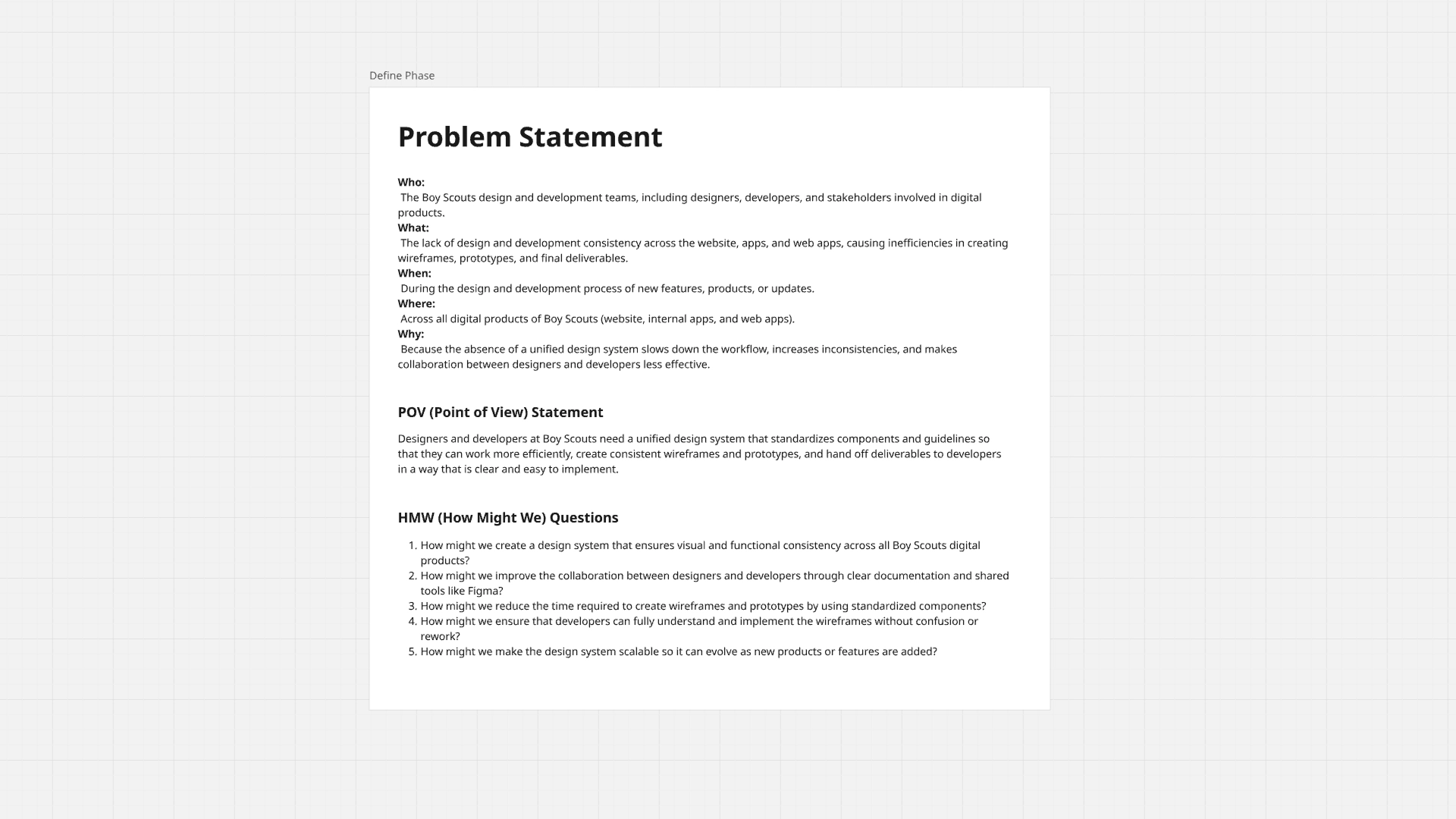
🧩 Problem
The Boy Scouts of America had multiple digital products—websites, mobile apps, dashboards, and internal tools—without clear visual or user experience consistency across them.
The only existing reference was the corporate identity manuals, which were primarily focused on branding and print, with very little guidance for digital products.
This led to several problems:
• Inconsistencies in colors, fonts, and components
• Lack of visual hierarchy and contrast
• Isolated design decisions between teams
• Constant friction between design and development
• Total dependence on Figma, a tool the developers were not proficient in
The need for a digital Design System focused on product, scalability, and collaboration was evident.
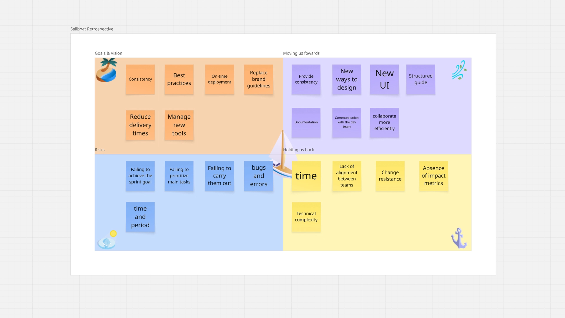
🔍 Validate
Before building the system, we validated the problem through:
• Visual audits of existing products
• Review of inconsistencies in UI and patterns
• Collaborative workshops to identify pain points and goals for each role
Direct feedback from:
• Designes
• Project Managers
• Developers
During these workshops, it was confirmed that the lack of a design system directly impacted:
• Delivery times
• Product quality
• Communication between teams
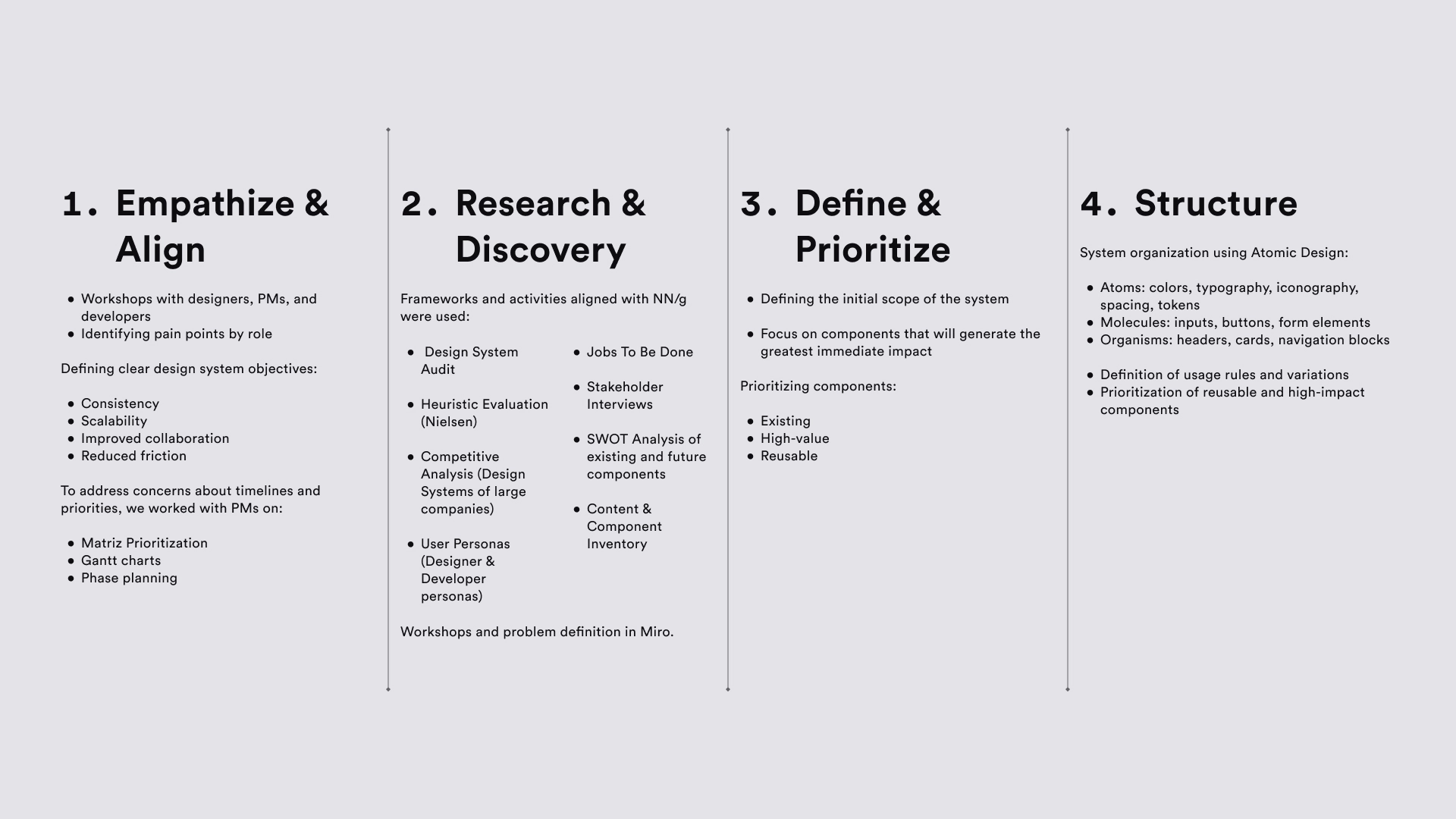
🔃 UX Process — Design System Workflow
The development of the Boy Scouts Toolbelt followed an Agile + Kanban + Atomic Design approach, supported by Design Thinking.
💡 Solution
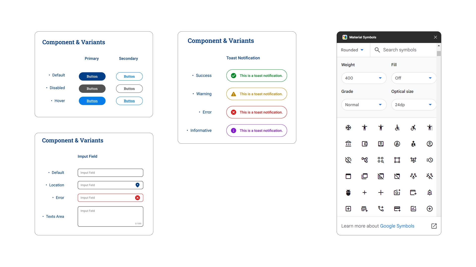
The result was the Boy Scouts Toolbelt, a structured digital design system that includes:
• Clear design guidelines
• Typefaces with defined hierarchy
• Accessible color palettes
• Reusable components with states
• Documented tokens
• Centralized documentation in Zeplin
A system designed not only to look good, but to work at scale.
📈 Result
• Significant reduction in delivery times
• Less friction between design and development
• Elimination of unnecessary meetings
• Greater visual consistency across products
• Improved cross-functional collaboration
• Solid foundation for scaling digital products
The design system has gone from being an “idea” to a real, everyday work tool.
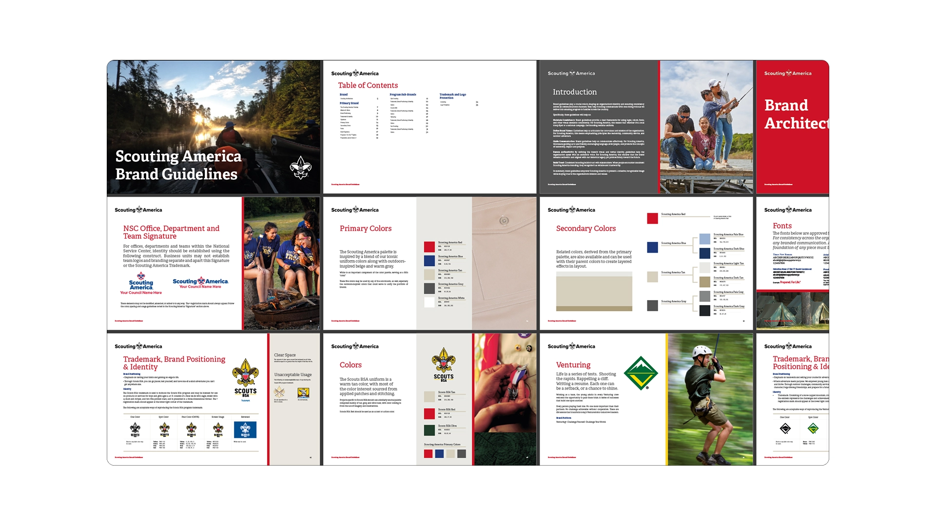
🎨 Brand Guidelines — Foundation
The starting point for creating the Boy Scouts Toolbelt was the official Boy Scouts of America Brand Guidelines, which defined colors, typography, and visual guidelines at the brand level.
However, these guidelines were primarily geared toward print media and branding, with little adaptation to digital products.
Our work consisted of translating these guidelines into a digital language, establishing clear usage rules for interfaces: typographic hierarchies, contrast, scales, component states, and consistent color application across web, mobile, and internal tools.
This allowed us to maintain the brand’s essence while improving readability, accessibility, and visual consistency across all digital products.
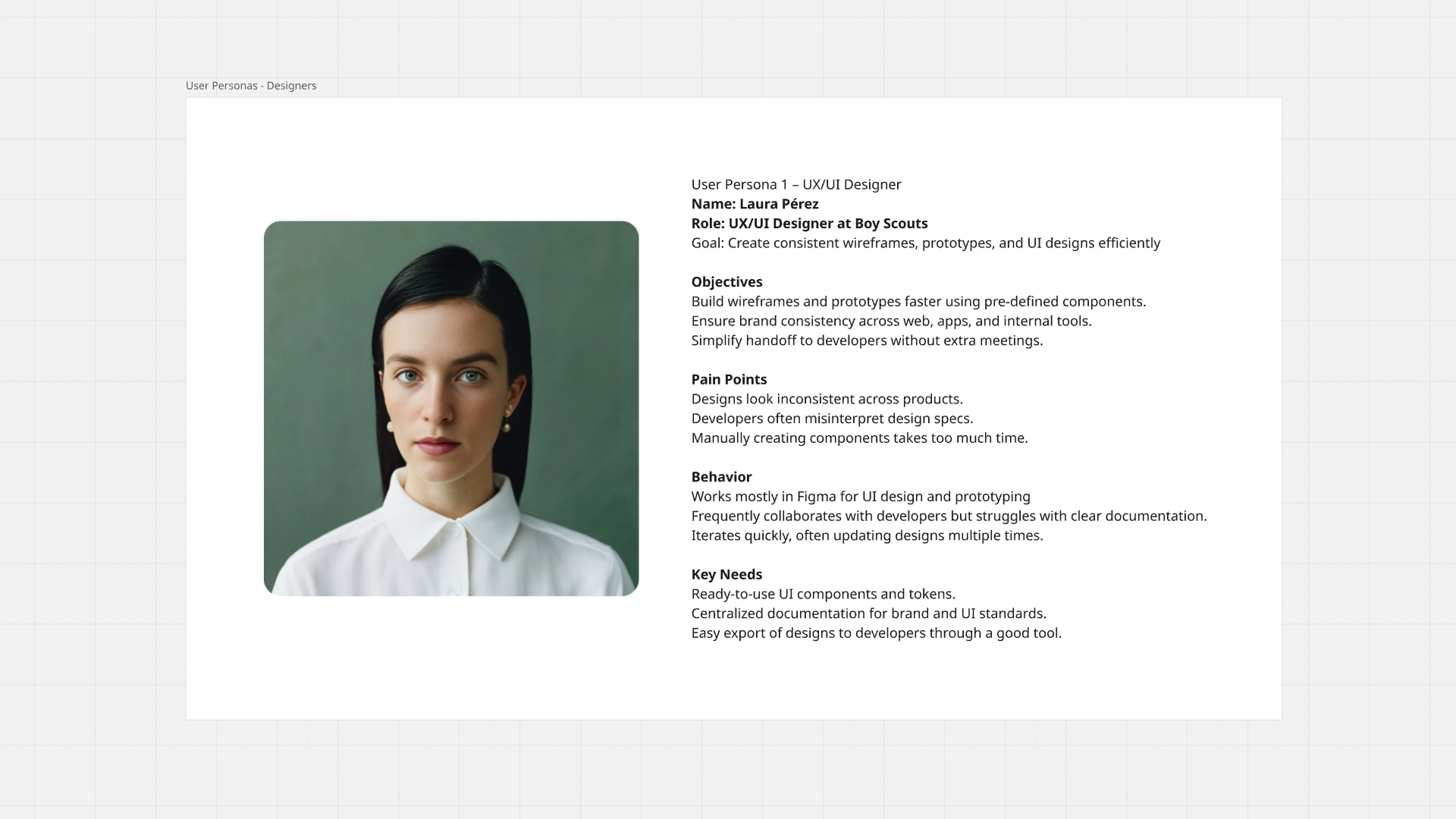
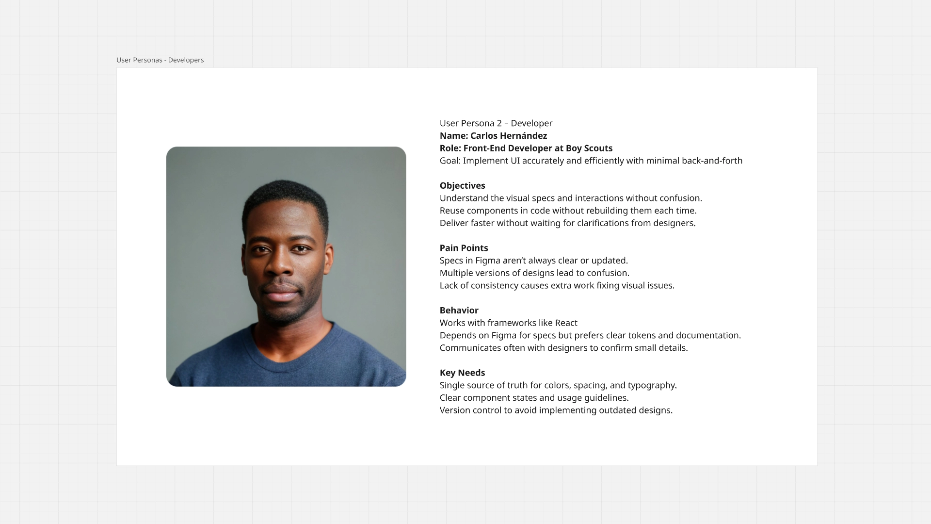
👤 User Personas — Designers & Developers
To ensure the design system met real needs, user personas were defined: UX/UI Designers and Front-End Developers.
These personas helped understand the goals, frustrations, and daily workflows of each role.
The designers needed speed, consistency, and ready-to-use components; while the developers required clear specifications, reliable tokens, and a single source of truth.
These personas guided key decisions about which components to prioritize, how to document them, and which tools to use, ensuring the system was useful, adoptable, and scalable for both teams.
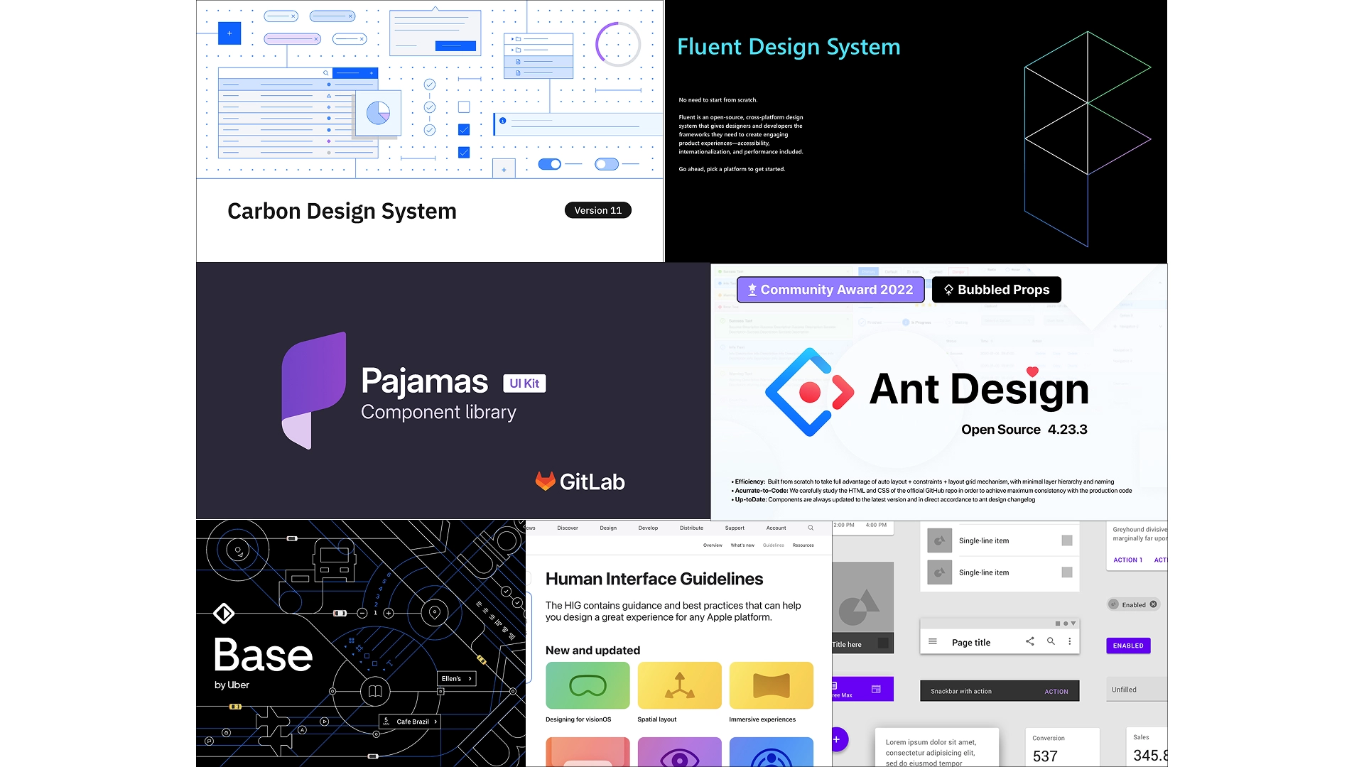
📚 Design Systems Explotation
To build a scalable and consistent foundation for the Boy Scouts Toolbelt Design System, I conducted an exploration of established industry design systems. This research helped identify best practices for component architecture, documentation structure, accessibility standards, and collaboration between designers and developers.
The exploration included well-known systems such as Carbon Design System, Fluent Design System, Pajamas Design System, Ant Design, Base Web, and the Apple Human Interface Guidelines.
By analyzing these systems, I was able to understand how mature products organize:
• UI components and patterns
• Design tokens (colors, typography, spacing)
• Documentation for developers
• Accessibility and usability standards
• Cross-platform consistency
• Solid foundation for scaling digital products
These insights informed the structure and principles of the Boy Scouts Toolbelt Design System, ensuring it followed proven industry practices while remaining flexible enough to support the organization’s digital products.
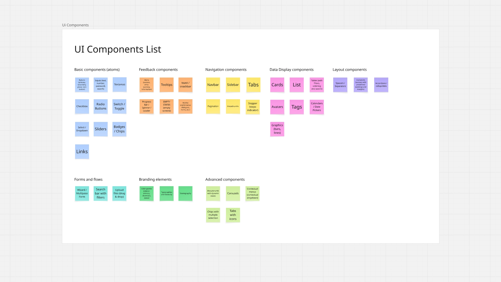
🧱 Component Inventory & Prioritization
After completing the design systems exploration, the next step was to identify and organize the UI components that would form the foundation of the Boy Scouts Toolbelt Design System.
I began by creating a comprehensive component inventory, listing all the potential UI elements needed across the platform. These components were grouped into logical categories such as:
• Basic components (atoms)
• Feedback components
• Navigation components
• Data display components
• Layout components
• Forms and flows
• Branding elements
• Advanced components
This process helped establish a clear overview of the system’s structure and ensured that all commonly used interface patterns were considered.
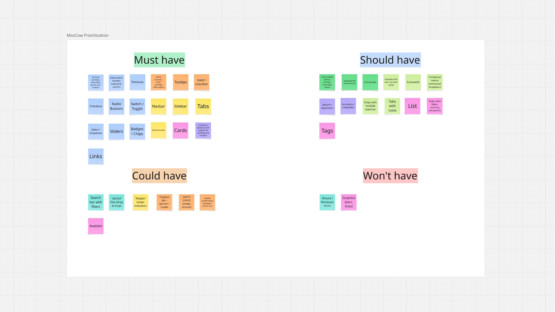
To determine which components should be developed first, I applied the MoSCoW Prioritization Method, a widely used product management technique that categorizes features into four groups:
• Must Have – Essential components required for the first version of the design system
• Should Have – Important components that improve usability but are not critical for launch
• Could Have – Additional enhancements that can be implemented later
• Won’t Have (for now) – Components intentionally postponed to future iterations
This prioritization allowed the team to focus on the most impactful components first, ensuring that the initial release of the design system delivered immediate value while remaining scalable for future expansion.
By defining a clear component roadmap, we were able to accelerate design consistency, streamline development, and gradually evolve the system over time.
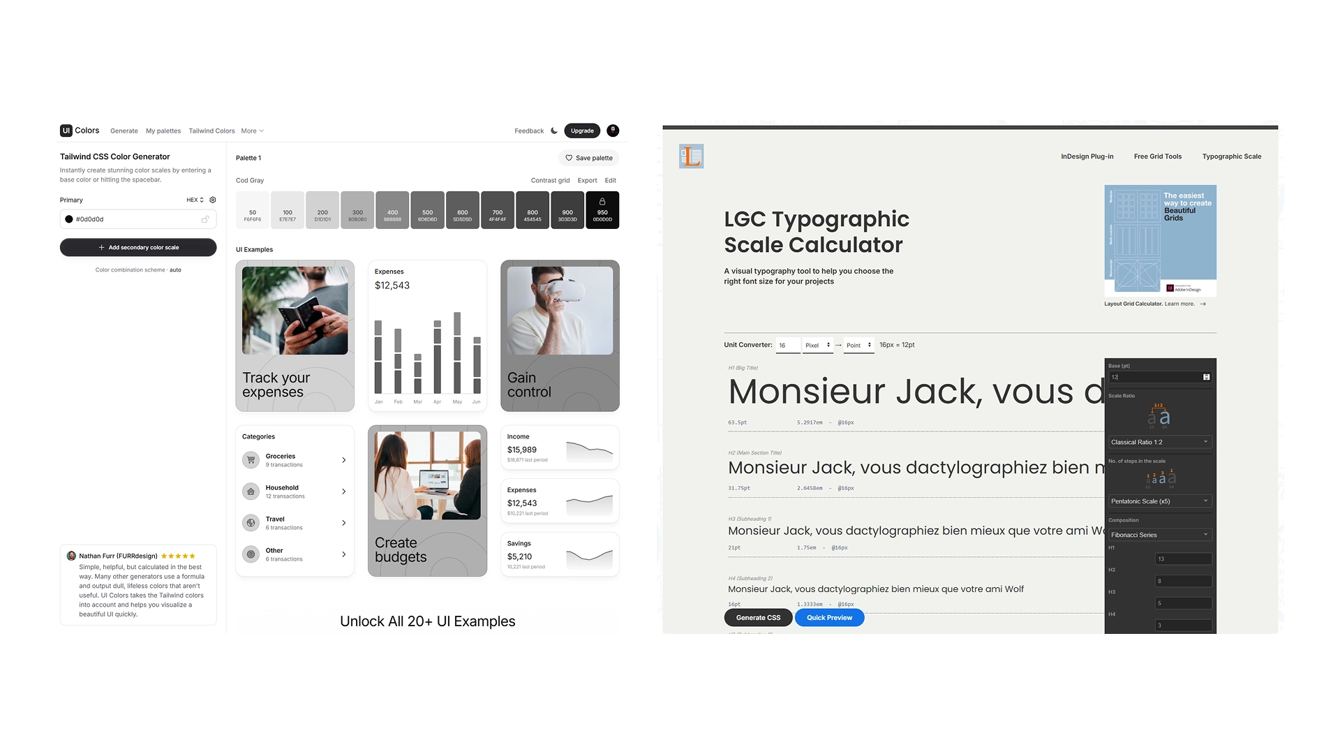
🛠️ Tools & Utilities
To build a robust and accessible system, the process was supported with specific tools.
UI Colors was used to generate accessible palettes with appropriate contrast, facilitating the definition of primary, secondary, auxiliary, and status colors.
Type Scale (Layout Grid Calculator) enabled the creation of a consistent and scalable typographic hierarchy, ensuring coherence between titles, body text, and secondary elements.
Furthermore, the use of the Material Symbols plugin in Figma helped maintain standardized, clear, and easily scalable iconography, reducing unnecessary variations and improving visual consistency throughout the system.
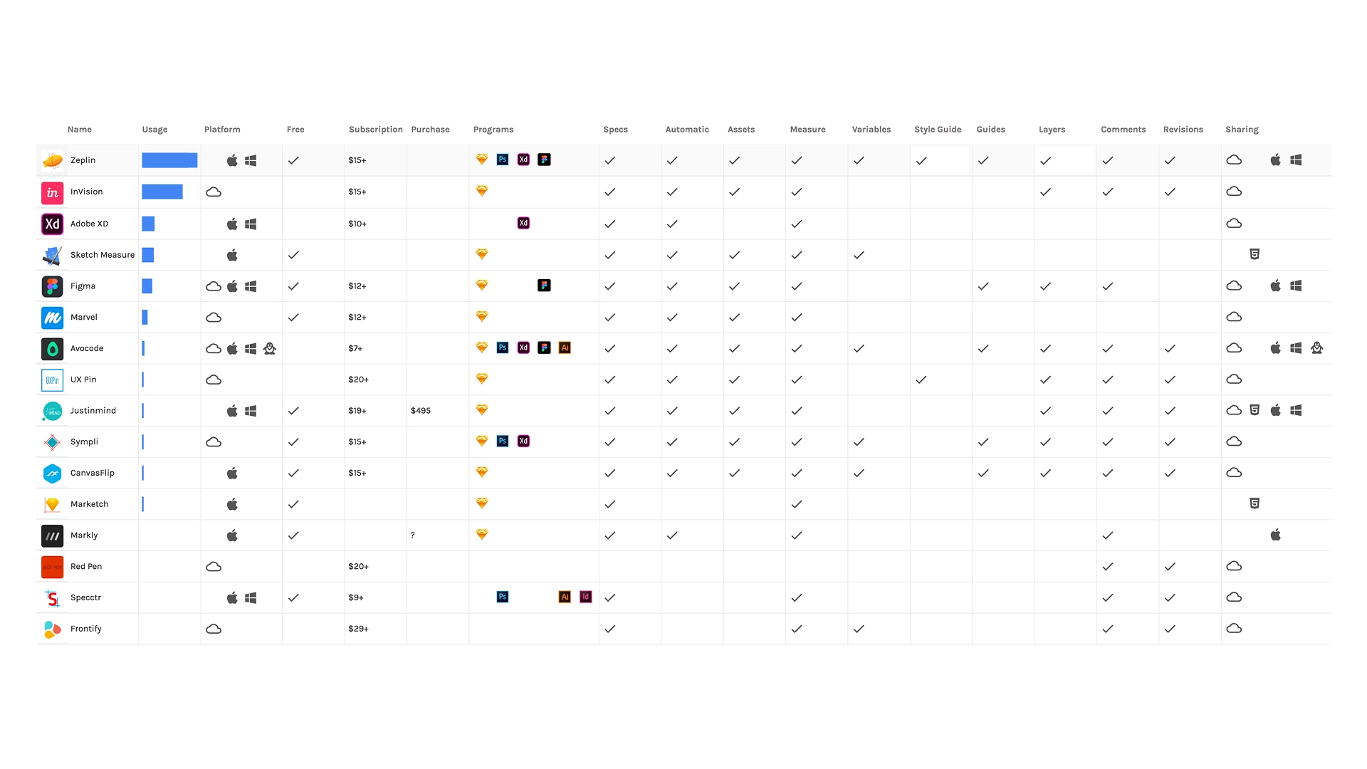
📊 Benchmarking — Best Handoff Tool
One of the main challenges was ensuring a clear and efficient handoff between designers and developers.
The goal was to reduce misunderstandings, eliminate unnecessary meetings, and provide developers with clear specifications, assets, and documentation so they could implement the UI more efficiently.
To achieve this, we evaluated several tools commonly used for design-to-development handoff workflows.
Design handoff tools help translate design files into developer-friendly documentation, including measurements, colors, assets, and code snippets that developers can directly use during implementation.
To streamline the design-to-development workflow, we benchmarked several handoff tools including Zeplin, InVision Inspect, Abstract, and Figma Inspect. At the time (2020), Figma’s developer features were still limited and Dev Mode had not yet been introduced.
Zeplin was selected because it provided the most complete developer handoff solution, automatically generating specifications, assets, and organized documentation that allowed developers to implement designs with minimal clarification meetings.
🤝 Zeplin Handoff Tool
Design Handoff & Collaboration Platform
Key strengths:
• Automatic generation of design specs
• Extracts colors, typography, spacing and assets
• Generates CSS, iOS and Android code snippets
• Organized styleguide documentation
• Developer-friendly interface
• Commenting system for contextual feedback
Zeplin converts design files into organized developer documentation, generating measurements, assets, and code snippets directly from the design.
Why it was selected:
• Clear developer inspection interface
• Centralized design documentation
• Reduced back-and-forth communication
• Easier collaboration between design and engineering
• Supported Figma exports even before Dev Mode existed