Boy Scouts of America
About
The stated mission of Scouting America is to "prepare young people to make ethical and moral choices over their lifetimes by instilling in them the values of the Scout Oath and Law". Youth are trained in responsible citizenship, character development, and self-reliance through participation in a wide range of outdoor activities, educational programs, and, at older age levels, career-oriented programs in partnership with community organizations. For younger members, the Scout method is part of the program to instill typical Scouting values such as trustworthiness, good citizenship, and outdoors skills, through a variety of activities such as camping, aquatics, and hiking.
To further its outdoor activities, Scouting America owns four high adventure bases Northern Tier (Minnesota, Manitoba, and Ontario), Philmont Scout Ranch (New Mexico), Sea Base (Florida Keys, U.S. Virgin Islands, and the Bahamas), and Summit Bechtel Reserve (West Virginia). Its local councils own nearly 100 camps and reservations dedicated to scouts.
Service
Ux/Ui Design, Ux Research, Product Design.
Client
Boy Scouts of America (BSA), Scouting America
Tools
Figma, Sketch, InVision Adobe Photoshop, Adobe Illustrator, Adobe After Effects, Jira, Miro, Zeplin, Lyssna, Wordpress, LottieLab, Jitter.
Team
BSA Product Designer, Product Managers, Developers, Stakeholders.
Website
🔒 NDA Notice
Due to a Non-Disclosure Agreement (NDA) with Boy Scouts of America, I am unable to share internal design files, detailed workflows, research artifacts, or visual materials related to the projects presented here.
The descriptions provided focus on my role, responsibilities, design process, tools, and impact, while respecting confidentiality and organizational policies.
💼 Role Context
I work directly with the Boy Scouts of America across multiple digital platforms, primarily:
• scouting.org (institutional and content site)
• scoutshop.org (e-commerce)
• donations.scouting.org (donations and appeals)
My day-to-day work involves improving, redesigning, and scaling existing web experiences, creating new pages, optimizing key flows, and proposing UX improvements based on research, testing, and ongoing collaboration with stakeholders, project managers and development teams.
🧩 Problem
The Boy Scouts of America manages multiple web platforms with distinct objectives: institutional information, e-commerce, and donations.
Over time, these platforms began to present challenges in:
• Visual and user experience consistency across sites
• Complex navigation in key flows
• Content scalability
• Lack of alignment between design, development, and business
Furthermore, given that it was a WordPress + Elementor-based ecosystem, it was necessary to design solutions that were realistic, maintainable, and easily deployable, without compromising the user experience.
🔍 Validate
Design decisions were continuously validated through:
• Direct feedback from internal stakeholders
• Usability testing with real users using Lyssna
• Heuristic evaluations to detect friction in navigation and content
• Ongoing review of qualitative metrics (clarity, comprehension, perceived effort)
This approach allowed us to confirm real problems before designing solutions and avoid assumptions.
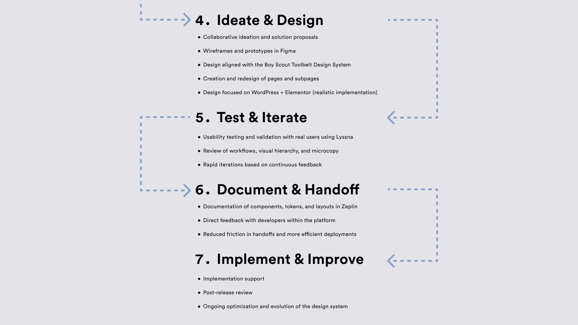
🔃 UX Process — Day to Day Workflow
Agile + Kanban + Design Thinking
The work was developed using an Agile methodology with Kanban flow, combined with Design Thinking principles, which allowed for continuous iteration and rapid response to changing priorities.
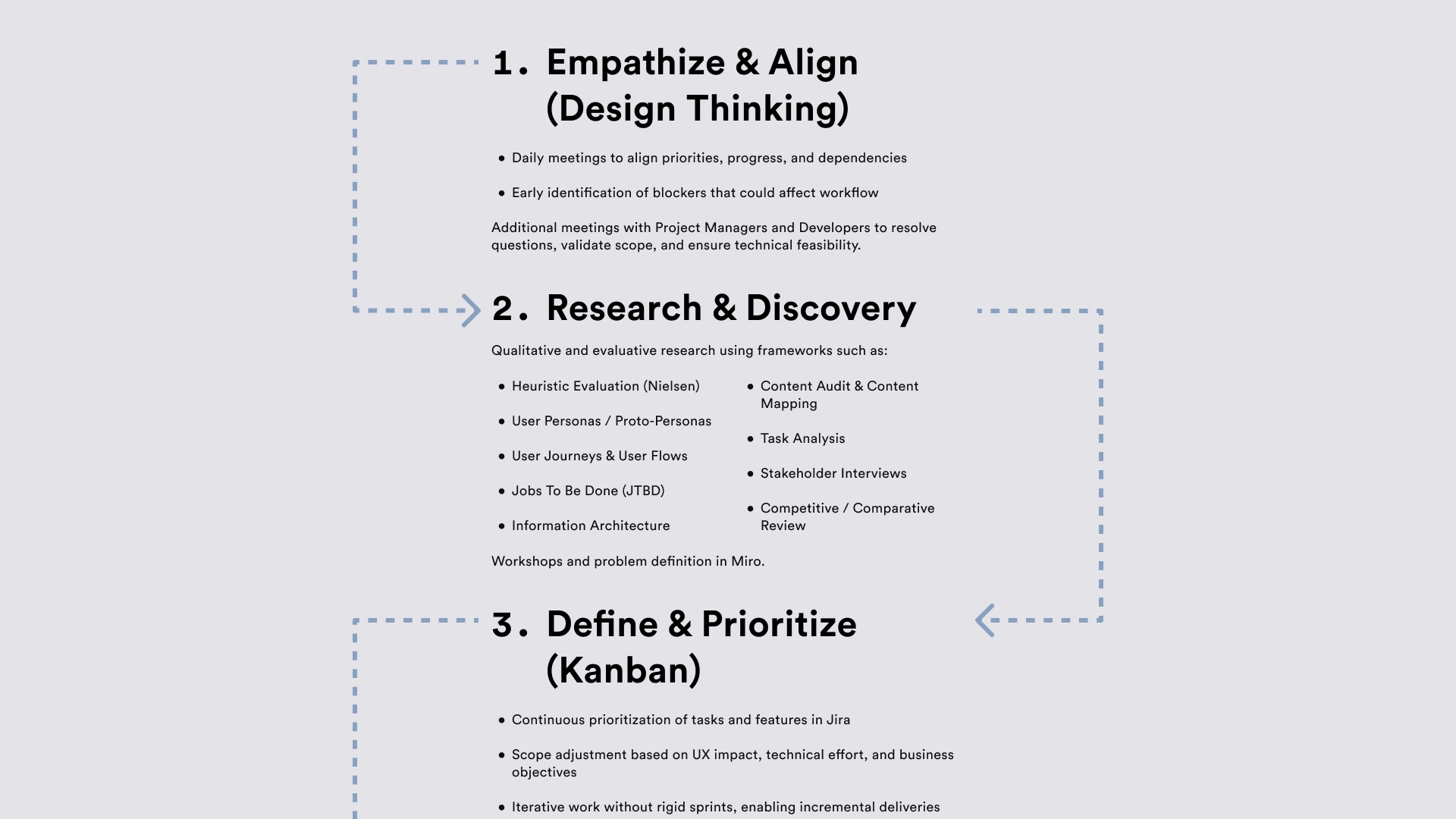
💡 Solution
UX/UI solutions were developed focusing on:
• Improving visual hierarchy and content clarity
• Simplifying navigation and critical flows
• Aligning the experience across platforms
• Facilitating maintenance and scalability in WordPress
The process included:
• Redesigning existing pages
• Creating new subpages
• Using before-and-after wireframes to demonstrate design evolution
Direct integration with the existing design system (Boy Scouts Toolbelt).
📈 Result
• Clearer and more consistent experiences across platforms
• More efficient and easier-to-understand workflows
• Improved collaboration between design, project managers, and development
• Faster implementations with less rework
• A solid foundation for scaling future UX improvements
This approach allowed us to improve product quality without breaking technical limitations or disrupting internal processes.
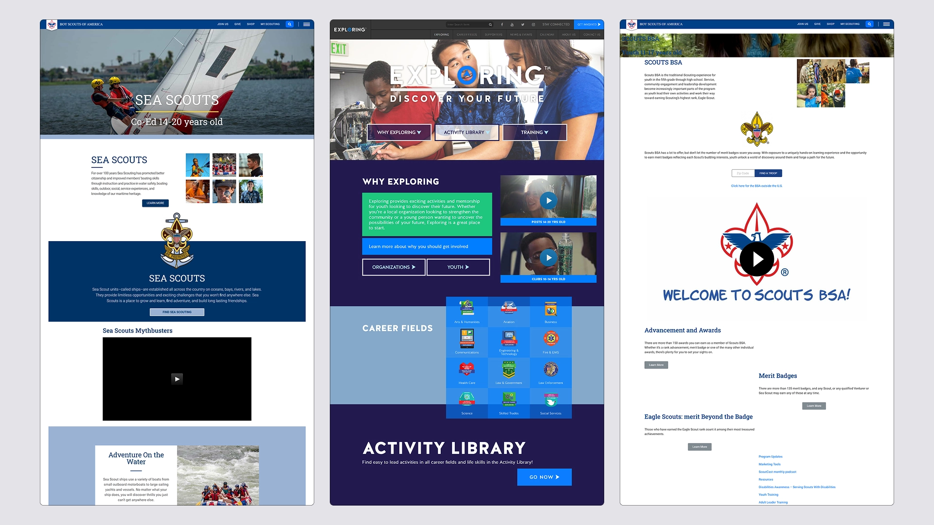
🔄 Before & After — UX/UI Improvements
⬅️ Before
Previous versions of the pages exhibited visual and user-friendly inconsistencies across sections and platforms.
The lack of clear guidelines led to variations in typography, colors, components, and visual hierarchy, impacting clarity, navigation, and the overall perception of the product.
Furthermore, the content structure did not always meet the user’s actual needs, creating friction in key user flows.
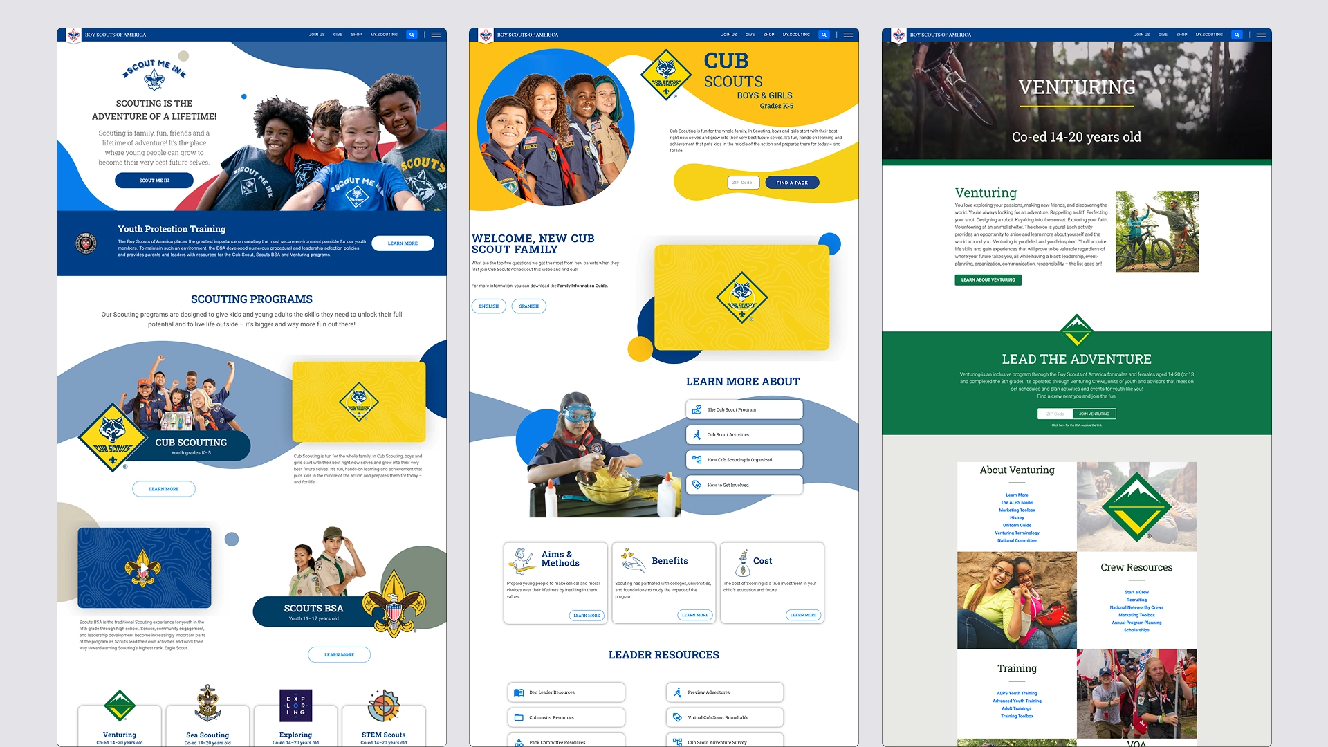
➡️ After
The redesign relied heavily on the Boy Scout Toolbelt (Design System), which significantly improved the design’s visual consistency, clarity, and scalability.
Thanks to a well-structured system with guidelines, defined typography, reusable components, states (hover, active, disabled), and a complete palette of primary, secondary, auxiliary, and state colors a more coherent and predictable user experience was achieved.
The content was reorganized with a clear hierarchy, better-defined CTAs, and layouts optimized for WordPress + Elementor, maintaining alignment between design and development.
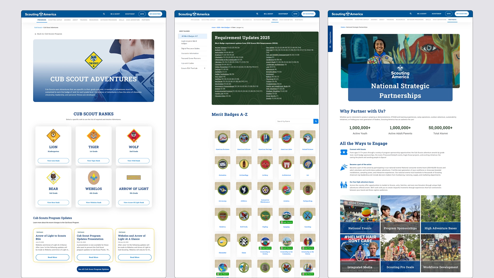
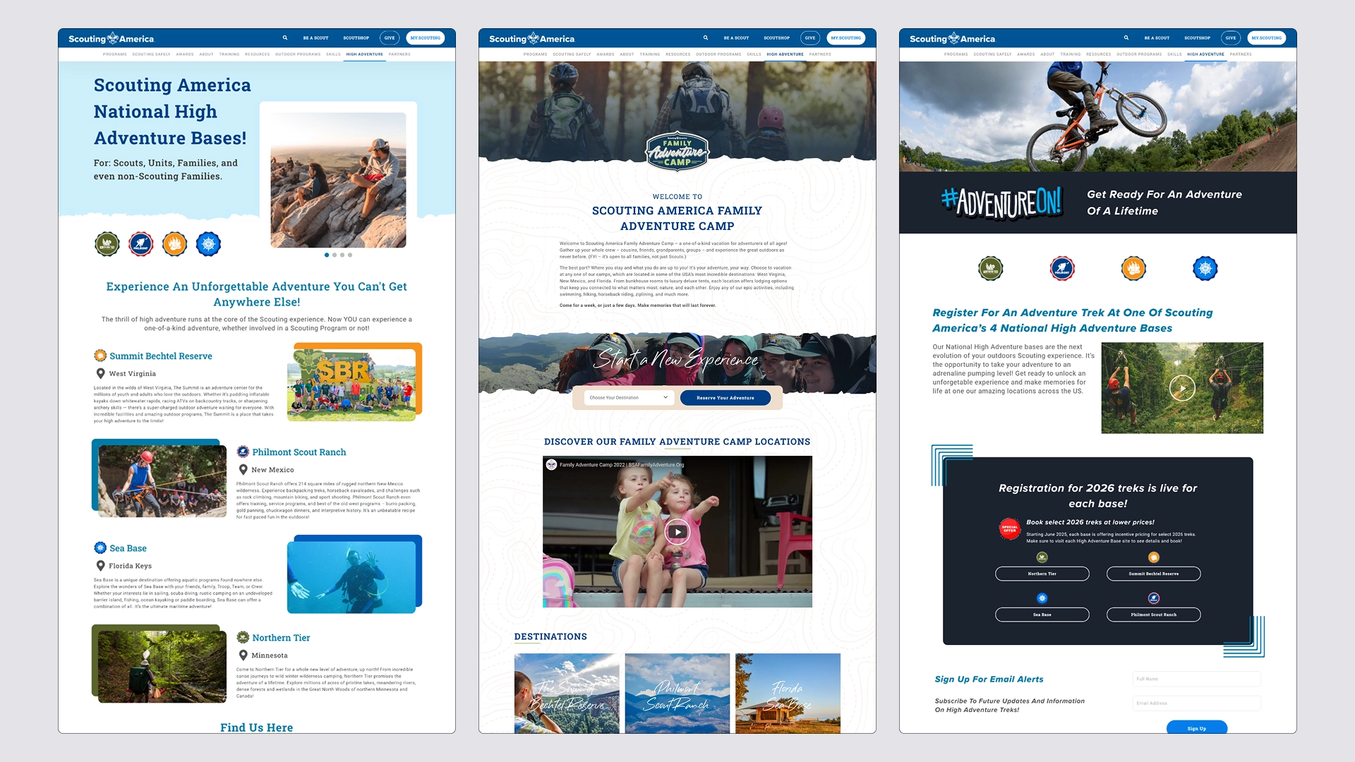
🎯 What Changed (Key UX Improvements)
• Visual consistency across all pages and platforms
• Correct use of typography and scales defined in the design system
• Reusable components with clear states
• Standardized color palette (primary, secondary, auxiliary, and status colors)
• Improved visual hierarchy and scannability
• More intuitive and predictable navigation
• Scalable and easy-to-maintain design